Notes on Design: In Praise of Ragged Edges
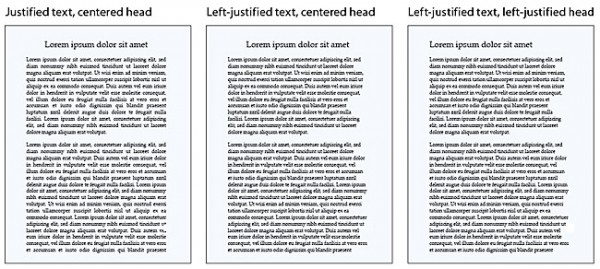
I am a largely self-trained book designer. I hope to someday have the time to take formal courses in design, but for now I do my learning by studying the books I read. This means that often I will come across a convention in book design that I simply do not understand. These conventions are not universal, but they are common. Indie and major presses seem to agree, for instance, that text should be blocky. In fact, the text of this website is mostly blocky.
What I am talking about is justification. At some point, nearly all the book designers in the US got together and decided that the proper alignment for prose was left-justified. What does a left-justified paragraph look like? Well you are reading one now. The left edge of the paragraph is aligned with the left margin, and the right edge of the paragraph is aligned with the right margin. The last line of the paragraph breaks this rule, because it would require extreme distortion of the text to ensure it met the right edge (the last line might be, after all, just one word long, and we don’t want to see that stretched all the way from left to right). But here’s the thing: essentially every line has to be distorted at least a little to make the edges match up right, and once you see this, it can be very hard to un-see it. The spaces between words and individual characters swell and shrink according to the needs of the line. You may find yourself struggling to read an especially crowded line; you may find yourself wondering why the spaces between the letters in the word “between” are so big. Words that disrupt the shape of the text too much become hyphenated in order to stop them from causing trouble. Sometimes they even split across two facing pages. Sometimes this is not disruptive. But sometimes it gets very ugly. READ MORE >