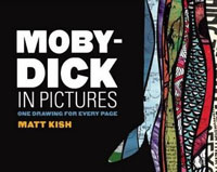
 Moby-Dick in Pictures
by Matt Kish
Tin House Books, 2011
600 pages / $32 Buy from Tin House Books
We often speculate on the future of the book, mourn its possible extinction, and dream of what strange offspring the future intercourse of form and technology might yield. In an age where digital media reigns supreme, Moby-Dick in Pictures is a brilliant, nightmarish argument in defense of the book as a physical object of art. It reads like a labor of hatred and love, the manifestation of the artist’s intimate and tortured, relationship with Melville’s nineteenth century masterpiece.
The formal method behind this project — one drawing for for every single page — is not new, but it still seems replete with unexplored potential. Back in 2006, Tin House published Zak Smith’s rendering of Gravity’s Rainbow into images. Matt Kish followed Smith’s lead, setting out, as he put it, to “show the signs of human hands, the presence of years, and the marks of hard use” (x) in creating this homage to what he calls his favorite novel. The project is first and foremost a collection of physical paintings, a few examples of which can be viewed on the Tin House web site; in fact, it was only after Kish had completed more than one hundred pages of the project that a fellow artist, Sophie Blackall, suggested that Kish consider turning into collection into a self-contained publishable object. So what, exactly, is this thing?
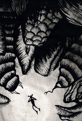
From cover to cover, Moby-Dick in Pictures is exactly what its title suggests: it’s Melville’s Moby-Dick; or, The Whale rendered into images. Kish used a variety of media, mostly ballpoint pens, markers, and oils. Each page contains a page number, a quote from the original Moby-Dick, the date on which Kish completed the drawing, the materials he used, and the dimensions of the physical drawing. The quote on each page is crucial to sustaining the book’s narrative; the drawings alone, though full of characters, action, and (in some places) dialogue, don’t fully convey the momentum and progression of the novel, but the textual quotations – often a sentence or two summarizing the page – serve to remind the reader what’s happening in Melville’s novel as it corresponds to Kish’s images. I have only read Moby-Dick once in my life, over seven years ago, and yet Kish’s book made me feel as if I were re-reading, re-imagining, and re-living Melville’s work as I first encountered it.
There is an impressive variety of artistic style in these drawings. Some pages call to mind the cartoonish pop-art of Roy Lichenstein (16), while others bleed into Rothko-like abstraction (423), and occasionally a page will include comic-book like thought bubbles (120). Every now and then a collage appears in the text, somewhat jarringly, with cut outs of “real” photographs overlayed onto newspaper clippings, not unlike Picasso’s early experimentation with college, and yet these palimpsest pages don’t work nearly as well as Kish’s original, often monochromatic drawings, which convey the urgency and intensity of his project most effectively.
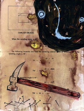
It’s also important to know that many of these pages are painted on abstract television repair diagrams showing all kinds of circuits, transistors, and other electronic esoterica. In some of the images, the electronic circuitry can be seen through the middle of the drawings, so that erratic lines and rectangles peer through the skeleton of a sperm whale, while in others Kish’s drawings dominate the page and conceal all visible source material. Some of the drawings were done on pages of the Bible, or philosophical texts, or even pages of Moby-Dick itself. In his introduction, Kish explains that he was “fascinated with the way certain elements of the diagrams showed through the paint, almost at random” (ix). As with the allegorical elements of Melville’s novel, for Kish, these “underlying diagrams reveal a greater complexity and a hidden structure” (ix). Kish has a judicious sense of balance, knowing when a blank white page serves his purpose best, as opposed to pages where the diagrammatic backgrounds enhances the book’s claustrophobic effect.
Kish is, of course, not the first person to re-purpose Moby-Dick into a different form. John Huston directed the excellent 1956 film adaptation, starring Gregory Peck as Ahab. Several comic-book versions of Moby-Dick have appeared over the years, including an edition released by Marvel Comics in 2009. And yet Moby-Dick in Pictures seems different somehow. As I read, I kept wondering if Kish had intended to mash-up Moby-Dick into something completely new and independent of its source; his book is definitely something novel, but it isn’t something that exists completely free from its predecessor, either. A true mash-up of Moby-Dick would sound more like Moby-Dick, or, The Whale from Outer Space, or something fundamentally different than what Kish or Melville have accomplished. If not a mash-up, then, I tried as I read (just because this is how my brain works) to categorize the novel into the accepted conventions of the graphic novel, the definition of which now appears in the Merriam-Webster dictionary as “a fictional story that is presented in comic-strip format and published as a book.” Moby-Dick in Pictures comes close to fitting that description, as it’s very much a fictional story, with characters, action, and corresponding conflict, but it isn’t really presented in comic-strip format, as comic books rely on multiple, self-contained frames per page, as opposed to Kish’s single-image-per-page method. Moby-Dick in Pictures, then, seems to exist within the center of a formal Venn Diagram, whose circles include the mash-up, the graphic novel, and the comic book, and whose influences are all evident in the text, but whose definitions ultimately fail to capture the scope and magnitude this project.
To simply call the book “awesome” or “bad ass” is, perhaps, a little reductive, but it’s tempting to summarize this project first and foremost by the undeniable pleasure it affords its reader. It is awesome, it is bad ass, but it’s also a formal argument in defense of the book as an objet d’art, as well as a complex remake of a nineteenth century masterpiece now rendered into something more accessible for an inattentive twenty-first century audience.
***
S. Tremaine Nelson is a graduate of Vanderbilt University and the Graduate Writing Program of Columbia University, which he attended on a Dean’s Chair fellowship. His writing has appeared in The Oregonian, The Northwest Review, and Publisher’s Weekly. He is a former fiction slush-pile reader of The New Yorker and administrator of the Literary Man blog.
Tags: matt kish, Moby-Dick, s. tremaine nelson, Tin House


Something I own along with Smith & Kish’s works which is at first blush something quite different, but ultimately something which I associate with the two in my mind: http://www.amazon.com/Paintings-Proust-Visual-Companion-Search/dp/0500238545/ref=pd_sim_b2
They had a preview of this in the latest Tin House and I think I’ve got to buy it.
Can’t wait to download it on iPad.
sweet, can’t wait to check this out. i think zak smith did blood meridian, too.
I just saw this book for the first time yesterday. And I feel obligated to mention Tom Phillips’s A Humument.
http://humument.com/
Mind you, it’s mainly my associative reasoning that makes me feel so obligated. This comment shouldn’t be understood as having either aesthetic or causal implications.
A-ha! It is rather, itself, collage!
Many cheers,
Adam
Tom Phillip’s A HUMUMENT is the coolest thing ever. Worthy of being re-released by someone in a bigger, fresher format, more like what Tin House has done so excellently with Kish’s work.
yea Humument is awesome. just taught it last week in my graphic texts class. also, more playful but fun: http://anncoulterhumandocument.blogspot.com/
Matt did some illustrations for my novel, The Snow Whale. It’s one of the highest compliments anyone had ever paid to my work. Since our books released within a few months of each other, the idea was to place the drawings in magazines as cross-publicity. But then Tin House said the images were too much like his Moby-Dick drawings (duh) and they told him not to work with me. I love that he did the drawings and both of us were surprised by the reaction of his publisher.
You can see them at his website: http://www.spudd64.com/thesnowwhale.html
[…] MOBY-DICK IN PICTURES by Matt […]
[…] about S. Tremaine Nelson’s review of Matt Kish’s MOBY DICK IN PICTURES on HTMLGiant, click here. Share this:FacebookTumblrPinterestTwitterLike this:LikeBe the first to like this. This entry was […]
[…] Moby-Dick in Pictures ( a must have for any literary man). My review of that book was published on HTMLGiant. Rumor has it Kish is working on an adaption of Heart of Darkness, although, for whatever awesome […]