Before and After
An analytical approach to living, that is a problem. I said it to S, I said I didn’t think that the examined life was the right one. I said it was, well, I could look it up it was on Gmail, but I’d rather try to remember. The point was, I was trying to tell him. I didn’t try that hard. I knew he wouldn’t like it if I put it that way, but the point was what I was feeling, which was that the too examined life lacked the types of brief, transcendent emotions that made it meaningful. If everything was studied very precisely, tried to be understood, attempted to be made into language, something was lost. More thoughts seemed to occur without language. Its usefulness to one’s, like, being could be put in question.
He seemed to think I was an idiot, he might have said so. G said what could I expect, he made his whole life based on that kind of tenet. That way of looking at things—S is a PhD—and trying to put that into some comprehensive explanation. Also he’s a poet. He never talked to me again. I can’t remember if I tried to strike up conversation with him. It must have been in winter. Could it have been during the time I was still doing crosswords? that was obviously a conflict of interest for me. There was a thing where I would always see the same words coming up, which was distracting. They’d be too easy or too hard.
I can find very little middle ground in stuff like that. I don’t know if I’d had the thought, but what if, what if, I had told him that I was more concerned with the exact reality as it appeared from an empirical, outside perspective, and that inner thoughts deflected it… Would it have been a lie? that actually bothers me a lot. How when you pose a question in writing (not a question in terms of “idea” but in terms of, like, a person thinking a question, I often think one vies to answer it), I always want to answer it immediately.
It was sort of a great relief, one less force to fear incurring—is it incurring?—my madness. My ideology appears, like it had sprung, only through disagreements with people. It’s weak. I felt like I’d escaped from the possibility of living S’s life. Something that required so much attention to the things beyond itself might cease to be substantive. Things are more often than not, I assert, concerned with what is directly, immediately happening.
Intelligent Design
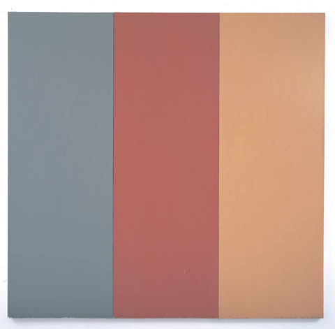
Pre-Morgan Brice Marden
An article published by The Chronicle of Higher Education discusses online ‘literacy traits,’ put simply, the lack of reading online. Myspace and facebook have turned the human race into a thumbnail. Of course, those of us here are in the old fashioned business of words—being writers, editors, and avid readers.
I will admit, I need to be somewhat invested in the prospects of reading a piece over 1500 words to print it out and read. My onscreen limit is usually under 1500 words. I’m occasionally frustrated when I can’t print out a story due to the web-file’s printer constraints. This got me thinking about various aesthetics of online journals—how editors/designers deal with not just internet’s short attention space, but the visual encounter with text, as the latter effects reader’s tolerance.
Seeing white words on a black background induces dizzy spells. It’s like looking into a congested night full of large ass stars. I much prefer when the words are deeper in tone on the gray scale with a black background. The classic black words on white is somehow the logical default to mimic the printed page, though I find black words on muted backgrounds (Hobart, Pindeldyboz, Juked) a little easier on the eye.
Margins are also a big deal-breaker for me. When there are no margins, and each paragraph stretches across the screen, it looks like some diaspora of abandoned words. In the end, you need to either mimic the printed page, or invent an aesthetic conducive to the screen.
This brings me to Bear Parade from our own Gene Morgan, and as of late, Lamination Colony by our own Blake Butler.
Bear Parade’s design IS the internet. It doesn’t need to mimic the printed page—in fact, it exploits the very qualities only possible on screen. Most of the stories in Bear Parade employ a ‘triad of tone’: 1) background color, 2) text color, and 3) rollover link color. The last one (3) seems almost incidental, but it’s a little blessing each time I rollover. It completely seals the context of the other two tones. Morgan is a rare colorist and designer; his choices are humble, sophisticated, and—perhaps most importantly—embody the tone of the story itself. In Small Pale Humans, readers might (just might) discover the faintest silhouette of a cactus, as if seen under the dimmest moon. Morgan tells a story with mere tone. He puts the zing in amazing.
Lamination Colony’s concerns are not so much about color (though the template light purplish page is deft) but self-conscious placement of text and imagery. The Woman Down the Hall is one of the most beautiful artifacts online. Each transition (the closest word I can summon to describe a ‘chapter’ in e-book scale) is an epiphany. Butler introduces a cinemagraphic element to journal design: fragmented and uncanny visual narratives—an intuitive evolution, given his self-professed Lynchian tendencies. My favorite transition is when an old woman’s face is followed by an extreme close up of the face. Butler draws the reader in closer, deeper. In another part, a small sentence is wrapped around like an egg, positioned perfectly on top an ominous source of light. Text also wraps around teeth. The guy is mad.
Some of you may accuse me of ingratiating myself to the editor and designer of this website. To that I say: I would say such things even on a desert island, holding a coconut, and looking for a bowling alley.
Uncategorized / 30 Comments
October 7th, 2008 / 2:36 pm
October 7th, 2008 / 2:36 pm