Faulkner in Color
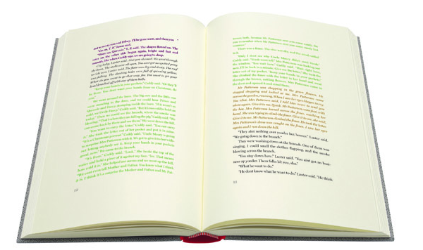
In 1929, at the time of its publication, William Faulkner said “I wish publishing was advanced enough to use colored ink” in regards to his vision for The Sound and the Fury, specifically, that each of the many intricately layered timeline threads would be printed in different colors. He resigned to using italics in order to address the past, which was rather confusing, given the blunt binary of italics vs. roman text, and the myriad tiers of pasts therein. Reading Faulkner, I always ignore the italics, as part of the allure in reading him is the palpable confusion of memory — the contradictions, oversights, strange overlaps — as similar to the very way we remember, or mis-remember, our actual experiences. The initial modernists (e.g. Joyce, Woolf, Faulkner) seemed to imbue their books, inadvertently or not, with living matter: the tongue of alliteration; the pulse of cadence; the corrosive and unreliable mind; the insecurity of communication; the unruly heart, the very messy things though which we lived, rather than simply read. Eighty-three years since its publication, English publishing house Folio Society is publishing the book as the author intended. It’s gorgeous, $345 dollars, a promised delivery conveniently in the light of August.
When the implied becomes the explicit, much of the beast is tamed, or at least caged. I personally love the what the fuck is going on feeling when slugging away at a book whose author was either psychotic or genius. I know it’s cliché, perhaps even a myth, but our perception of the author’s psychiatric state informs the value of its literature, which may implicate the inherent pathos of secular western art. It’s like The Maury Povich Show or Jerry Springer: one is simply gladdened to see crazy people on stage. I think of William, in a spare bedroom scratching chapter notes for a novel on a wall named after days of the week he clearly lost track of, and am touched. I have this theory where the more awful a roommate a writer would be, the better the literature. (Kafka totally late on rent; Emily Dickinson never leaving the goddamn the house; Henry James clearing out the fridge at night.) When a handful of dedicated editors distill Faulkner’s modernism into a color key, he almost comes across looking like a fraud who threw his manuscript across the room, picked up the pieces, and called it done. The reader lends the novel intent in exchange for meaning.
This is of course a cynical view of both Faulkner and this new publication. The hardest fiction is the barest — written in a straight line, with plain paragraphs, some dialog, and clean chapters. Joyce broke the novel, and repairing it seems more difficult than repeatedly smashing the bits and pieces left on the ground. Vonnegut’s doodles, D. F. Wallace’s footnotes, and the manic font changes of Gass, Barthe, and most recently Leyner, all seem slightly archaic in their exuberance. The novel, like painting, flourishes from its very constraint. You have black and white words, the careful choreography of twenty-six letters, in staunch rows, one on top of the other, fraying downwards, until the physical end of its last page. The object of a book itself is a concession to its medium. And therein lies infinity.
Knowing who and what and at what time you are reading before it has a chance to ruin you takes the humiliation out of reading, that desperate attempt to understand your partner. One may experience the same feeling sitting alone at the table after a date unexpectedly gets up and leaves. Did I do something wrong? You go back, rereading the dogeared page. The novel, after all, is like dating — better if you imagine beautiful people, perhaps in a translated accent, and under more romantic lighting. All you want is to be loved, so you keep reading. Maybe this time you’ll find the one. I’m glad color printing (and anti-depressants) weren’t around in 1929, and worry for the precocious kid whose parents drop some three hundred dollars on a less confusing experience. Sure, Faulkner wanted it this way. But he was nuts. I imagine this kid reading it without a snap, closing the book, and going about thinking they understand this cuckoo world.
the first time I read The Neverending Story it was a copy from my elementary school library that had colored ink to differentiate between the real world and Fantastica. it was so awesome that I get weepy thinking about it and have thought many times about trying to steal it
I realize this doesn’t address the major points of the post and sort of clings to the minor thing instead, but whateva
Imagine if “J R” by Gaddis had this. I’m confused what the market for this is though; anyone who cares enough about Faulkner to drop $345 would certainly not need it, and probably would find inferior to the subtlety of the canonical version.
i just bought a folio society copy of moby dick & i’m reading go down moses, making this a kind of red sea for me
I don’t feel cynical about it; it’s cool to relate a color to a concept, maybe the closest I’d ever personally get to synesthesia and I’d like it to be with Faulkner over anyone else. Somebody loan this to me
One wonders how much less one would be ‘reading Faulkner’, having gotten used either to recognizing shifting times in The Sound and The Fury or not (or somewhat, and being comfortable enough with that). With him more so than most writers, figuring out even what’s happening in the story is the story of reading the story, I think, for most readers.
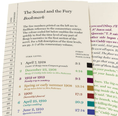
But a powerful push towards accepting this layout for this novel is the fact that it’s Faulkner’s idea–how he wanted the book to appear to its readers. –so resorting to a prefatory key would be, in the way of letting a writer control the reading process, more authentically ‘Faulknerian’. –or with a mobile key placed as a “bookmark” wherever one is reading, for those who tolerate stiff bookmarks.
He did label the chapters in As I Lay Dying by their sources (regardless of their length or the obviousness of the voice), obviating the need for the reader to figure out whose mind is talking.
I’d like to read The Sound and The Fury this way.
i would want two copies of this, one to cut (with real scissors) and paste (with real paste), all red parts together in order, all blue, etc etc (composed – into a blank book? on the wall? multiple walls? in different rooms?) (insomnia project!)
and one to keep intact
and of course the no-color-coding version to get lost in
..
the more i think about this the less i like it
(i’ve been thinking about it kind of a lot)
could you do this with all of deaders’ comments from now on, please, jimmy?
it would help me a lot!
color-coding for deaders’ comments would be a lot more helpful to me in understanding deaders’ comments than color-coding for ‘the sound and the fury’ would be helpful to me in understand ‘the sound and the fury’
The arguments against this version strike me as, at best, a sort of,”I had to walk to school barefoot in the snow so why shouldn’t everyone” curmudgeonry, and at worst, a genuine disdain for the masses of people who read for pleasure rather than accomplishment. I enjoyed the monochromatic version, but if this version helps a few more people see Faulkner as a pleasure rather than a struggle that the author himself never intended, then I am all for it. And remember, if it makes you feel elite to slog barefoot through the snow, no one is forcing you to take the bus.
[…] publishers the Folio Society released a new edition of The Sound and the Fury that uses colored ink to signify time changes, as Faulkner originally […]
[…] missed it in willow springs’ twitter feed last week, there was a post on htmlgiant about how faulkner wanted to print the sound and the fury in color. i’m honestly unsure whether that would help me understand the book better, or make it […]
Regardless of what side of the ‘debate’ I am on, I just wanted to say that this is a really brilliantly written post.
i liked this: “It’s like The Maury Povich Show orJerry Springer: one is simply gladdened to see crazy people on stage.” and also i agree with your point. i hate how authors feel like they need to make books super fragmented and visual because of iPads or ‘new reading technology.’ you said it well here: “The novel, like painting, flourishes from its very constraint.”