July 30th, 2010 / 2:34 pm
Random
Jimmy Chen
Random
Regarding the growing tendency in book design to cover people with white boxes


Book designers are either getting lazy — defaulting to a quick white box with typography on stock photo — or this implicates something deeper, an imposition of “the generic” over a fragmented body; a kind of disenchanted corporate-aesthetic “labeling” of ourselves. The people on the covers do well to evade the reader, this ironic cult of anonymity during such narcissistic times. It’s as if the writer (or publisher) were coaxing us, challenging us that the shallow and passive super-impositions are followed by much more depth inside. Or maybe it’s just minimalism, which I use as an excuse for my salary.
I’ve noticed this too. Good post.
I think it’s both. Or it’s racism.
blame BEople magazine.
or don’t. at least they used a circle.
it’s laziness, i think.
Somebody did it, the cool kids in graphic design liked it, and so it becomes a trend, then it becomes passe. In a few years, we will see no new covers like these.
I love how the Englander book even gives the author’s name the same treatment, like it’s a meta-cover.
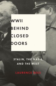
Also, what the hell is up with the ultimately left justification of WWII Behind Closed Doors? It looks awful without any padding on the left, especially in constrast with the center justification of the rest of the text.
I think it’s a lazy way to get around breaking the cardinal rule of book design: don’t put faces on your book covers.
I’ve been walking around with a white box on my face all day. The generic is very popular right now. Another thought-provoking post, Jimmy Chen (grateful tone).
I’ve noticed this too. Good post.
I think it’s both. Or it’s racism.
blame BEople magazine.
or don’t. at least they used a circle.
it’s laziness, i think.
I like these better than the picture of the toy/piece of candy in the center of a saturated field of color, big in the 90’s and with Rick Moody.
Somebody did it, the cool kids in graphic design liked it, and so it becomes a trend, then it becomes passe. In a few years, we will see no new covers like these.
I love how the Englander book even gives the author’s name the same treatment, like it’s a meta-cover.
Also, what the hell is up with the ultimately left justification of WWII Behind Closed Doors? It looks awful without any padding on the left, especially in constrast with the center justification of the rest of the text.
I think it’s a lazy way to get around breaking the cardinal rule of book design: don’t put faces on your book covers.
I’ve been walking around with a white box on my face all day. The generic is very popular right now. Another thought-provoking post, Jimmy Chen (grateful tone).
I like these better than the picture of the toy/piece of candy in the center of a saturated field of color, big in the 90’s and with Rick Moody.
You seen the new Stephen King book’s covers? There are four of them, each one facier than the last.
In the UK, anyway.
Also, I saw that Tim Wise cover a while ago and thought of this: http://upload.wikimedia.org/wikipedia/en/thumb/2/29/Blackholecover.jpg/250px-Blackholecover.jpg
You seen the new Stephen King book’s covers? There are four of them, each one facier than the last.
In the UK, anyway.
Also, I saw that Tim Wise cover a while ago and thought of this: http://upload.wikimedia.org/wikipedia/en/thumb/2/29/Blackholecover.jpg/250px-Blackholecover.jpg
Undiscovered gyrl cover looks particularly like it was made in MS paint!
You dream your whole life of having a book published, and a publisher sends you something like that… how do you feel?
Undiscovered gyrl cover looks particularly like it was made in MS paint!
You dream your whole life of having a book published, and a publisher sends you something like that… how do you feel?
Much less philosophical, but in the first two examples, this lets an author get away with having a photo representation of his or her character *without* wholly tainting the reader’s imagination.
Much less philosophical, but in the first two examples, this lets an author get away with having a photo representation of his or her character *without* wholly tainting the reader’s imagination.
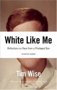
This works for White Like Me, where it reduced the yearbook photo just to its social signifiers. You normally think of portraits as a chance to isolate the face, but in that cover you realise how much extra information is in there: whiteness, maleness, wealth, youth. In the WLM cover the man’s individuality has been completely erased by his inflated social status. It also works for WWII Behind Closed Doors. It looks like a speech bubble, Stalin stage-whispering behind a hand, and a redacted document. It also makes an overall composition suggesting a door with a big window in the top half that you can look through to see the title of the book. I can’t see any good reason for the other examples.
This works for White Like Me, where it reduced the yearbook photo just to its social signifiers. You normally think of portraits as a chance to isolate the face, but in that cover you realise how much extra information is in there: whiteness, maleness, wealth, youth. In the WLM cover the man’s individuality has been completely erased by his inflated social status. It also works for WWII Behind Closed Doors. It looks like a speech bubble, Stalin stage-whispering behind a hand, and a redacted document. It also makes an overall composition suggesting a door with a big window in the top half that you can look through to see the title of the book. I can’t see any good reason for the other examples.