March 30th, 2010 / 7:09 pm
Snippets
Snippets
Jimmy Chen—
—
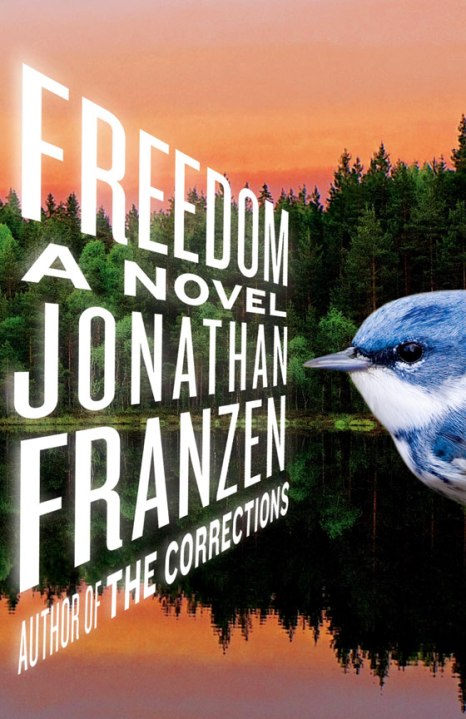
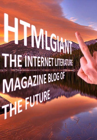
[via The Millions] Jonathan Franzen’s long awaited novel’s cover is out. I’m actually pretty excited about this. Hungry to get in on the pastoral rage, we’ve mocked a similar cover, with a little birdie of our own. Sorry, symbolism is so [18]80’s.
That hand looks horrible, like turkey vulture genitals basically
That hand looks horrible, like turkey vulture genitals basically
wack
wack
HAHA…
I really like the Franzen cover. It make me actually want to read the book.
HAHA…
I really like the Franzen cover. It make me actually want to read the book.
i like your mock-up better, it’s got far more balance & symmetry.
i like your mock-up better, it’s got far more balance & symmetry.
i don’t care for the cover or the title, to be honest. looks like a postcard from a tackle shop or something, and Freedom would be what it says on some placard on the wall. though maybe that’s the vibe he’s going for (?)
i don’t care for the cover or the title, to be honest. looks like a postcard from a tackle shop or something, and Freedom would be what it says on some placard on the wall. though maybe that’s the vibe he’s going for (?)
‘The Corrections’ is a pretty awful title, as well.
Is the bird supposed to be reading the writing, standing/flying perpendicular to it? Is that the reason for the perspective? It looks like it might be some sort of Minority Report-esque hologram technology.
‘The Corrections’ is a pretty awful title, as well.
Is the bird supposed to be reading the writing, standing/flying perpendicular to it? Is that the reason for the perspective? It looks like it might be some sort of Minority Report-esque hologram technology.
I think the Franzen cover is ugly as hell. And I wouldn’t read another Franzen novel for the world. I can’t think of a recent book praised as much as that one that I disliked more.
I think the Franzen cover is ugly as hell. And I wouldn’t read another Franzen novel for the world. I can’t think of a recent book praised as much as that one that I disliked more.
I think it’s supposed to look intentionally ugly/hokey. At least that’s how I’m reading it. The awkward placement of that bird nearly makes me shit. If the cover designer wasn’t shooting for camp aesthetics, then that only makes it better.
Agreed that Franzen’s last two titles have been horrific. Freedom, really? And I don’t really expect to like the book—I too have gotten sick of his work. Maybe I’ll just stare at the cover in the bookstore.
http://ellenwernecke.tumblr.com/post/482385237/this-is-the-real-cover-bubleraptor-you-complete
http://ellenwernecke.tumblr.com/post/482385237/this-is-the-real-cover-bubleraptor-you-complete