Web Hype
Blurb watching


An initial cover version of Freedom showed an orange sky, evocative of sunrise or sunset; the “final” version has a cooling blue swath in the sky (and its lake reflection) which broadens the time-line to a more general dusk or dawn. It’s as if the publisher Farrar, Straus and Giroux, whose air-conditioned offices are a balm for those successful enough to work there, weary of the humid “southern” light, wanted to Yankee it up and “cool it down.” The blue, visually, plays off the bird; and painterly, is the compliment of the orange. As a rule, I don’t like birds, nature, or rasterized font in perspective on covers, but I actually like this cover (I guess three wrongs make a right). The pictured lake is undoubtedly the Minnesotan lake at which the novel’s most manic drama occurs, and I’m transported there, the vector of my sad literary Updikian erection pointed at an awesome fuck scene, careful not to get any paper cuts.
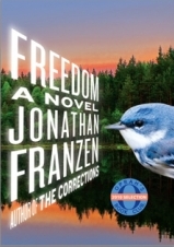 The cover of course has been forever Oprahfied, that kind of obscene self-promotion sticker operating under the false auspices of enthusiasm for an abstract marketed readership, which rather reminds me of blurbs; no matter how gushing, how charming, the author’s name (of the blurb) is the true currency of each letter it takes up. Look, O.’s design team even matched the blue/orange color motif, how considerate. The bird pictured is the endangered Cerulean Warbler, who Franzen — an avid bird watcher — appoints as the mascot of our dying. (Haha, I just said “mascot of our dying”; been Franzenfied I guess.) It’s funny how the Franzens vs. Oprah [Oprah], Gaddis [The New Yorker], and Ben Marcus [Harper’s] have come to represent so much about not only the publishing industry, but the staunch [ir?]relevance of realism in literature today, as met with the other staunch [ir?]relevance of formalism. (One more -ism time for da’ Jesus to risen, so watch the fuck out.) Perhaps that O. sticker is an allegorical bird too, some sticky wingless mutant, affixed to the cover’s surface with the hand of commerce, never quite part of the story, but too much a part of everything else.
I wish she’d slap that on something of mine.
I think “that O. sticker” is an egg – my A Field Guide to Ornithological Ejecta calls it ‘Franzenian Facial Egg’.
I would only read the unblued version.