Web Hype
Typography: an analysis
The online literature world can be broken down into two groups: the ‘Bookish’ and the ‘Sophisticated.’ These groups convey their partisanship with fonts. The font world is broken down into either serif (Times New Roman, Garamond, Georgia) or sans-serif (Helvitica, Veranda, Arial). Of course, there are overlaps, but I’m talking about ethos here baby, shit. From editorial discretion to readership disposition, there is no denying font type. Below is an in depth analysis on the demographics of font-people.
 I. BOOKISH
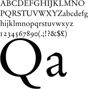
‘Bookish’ people have a lot of books on their shelves and smell like libraries. They read a lot, often dense and abstruse stuff that ‘normal Walmart people’ won’t understand. When I list serif-populated websites, you will know exactly what I’m talking about: McSweeney’s, elimae, eyeshot, Prick of the Spindle, pequin, etc. See what I mean? Now can’t you just imagine a bunch of people wearing elbow patches w/ thick-ass glasses in Cambridge reading this stuff? They are very attached to the printed word — with those lyrical cursive-esque ‘thingies.’ These people are likely to drink herbal tea in the afternoon and cry occasionally. You will find an unread copy of Mason & Dixon on their shelf. They are often pale, white, and pudgy. They have uninspired, or even ‘bad’ sex because they are always thinking about grammar.
 II. SOPHISTICATED
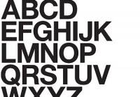
There’s this documentary “Helvetica” which I found really annoying. It was all these Europeans who ‘went off’ on how they changed the world with that font. Helvetica (or Microsoft’s bastardized version Arial) is used everywhere (picture the Target or JC Penney logo). There’s this idea that sans-serif fonts are more modern and ‘with the times.’ Minimalism, from which sans-serif was derived, attracts cynical people. (None of the propagators were breast-fed.) Here are examples: Muumuu House, HTMLGIANT, No Posit, (most of) Bear Parade, Robot Melon, My Name is Mud, etc. See? Now can’t you just imagine a bunch of people sitting on $2000 design chairs with their German techno in the background eating freakin’ carpaccio off of square plates? These people do not believe in God.
Conclusion: The only non-annoying font-type is braille. : : . . : .
See what I mean?
Tags: fonts, typography
Hard-hitting investigative journalism.
I like this post. Thanks for mentioning NO POSIT. Now, excuse me, I must jet off in my Volkswagen golf that runs on vegetable oil.
Hard-hitting investigative journalism.
I like this post. Thanks for mentioning NO POSIT. Now, excuse me, I must jet off in my Volkswagen golf that runs on vegetable oil.
VOLKSVAHGEN GOHLF
VOLKSVAHGEN GOHLF
jimmy forgot to say that both types secretly read the ‘twilight’ book series.
it’s all about wingdings bitches.
jimmy forgot to say that both types secretly read the ‘twilight’ book series.
it’s all about wingdings bitches.
ja!
ja!
what about verdana what about it
what about verdana what about it
this country’s favorite font
http://www.whitehouse.gov/
this country’s favorite font
http://www.whitehouse.gov/
my favorite is sylfaen
my favorite is sylfaen
Wow… All this time i thought fonts just were a way of printing text in an attractive way, but now I’m finding there’s a whole font world! Do they have little font houses and font toilets and font shopping centers? Or do they live in font burrows and hunt in font packs so they can eat origami creatures?
By the way, Yippee is printed in Georgia 10 pt font.
i think that calibri is a precise, clean, simple font.
garamond is good too, for print
i think that calibri is a precise, clean, simple font.
garamond is good too, for print
i agree with garamond. i like it the most.
i agree with garamond. i like it the most.
q: is it wrong give yr font its own font sweater? cause it gets cold you know.
q: is it wrong give yr font its own font sweater? cause it gets cold you know.
i write everything in graffiti letters smd.
i write everything in graffiti letters smd.
Yeah, way to forget about verdana there JIMMY CHEN.
I am going to start a huge internet argument with you.
JIMMY CHEN IS A JIMMY CHEN FACE.
Yeah, way to forget about verdana there JIMMY CHEN.
I am going to start a huge internet argument with you.
JIMMY CHEN IS A JIMMY CHEN FACE.
serif fonts 4 life
serif fonts 4 life