Games Taught Me to Care About You
When presented with bad design, I often become irrationally, almost violently angry. The first time I was exposed to the class registration system at NMSU, I was seated at a university computer, in a public place, with my wife. None of these things stopped me from thumping the desk with my fist after twenty minutes of trying and failing to make the goddamn thing do what I wanted. I have said that bad design actually makes me more angry than the Holocaust; this is true. Obviously the Holocaust was worse than bad design, but I have no direct experience of its horrors. Bad design is with us every day, corroding us inside and out. It feels more immediate, to me. It feels oppressive.
Bad design makes me so angry because it is a message from the world, a whisper. It says: “No one cares about you. No one knows that you exist. No one knows what you are like. No one has taken the time to imagine you. No one wants to think about what you need or want. You are profoundly unimportant.”
A guide for those who would be typeset
Today at Slate, Farhad Manjoo does editors and designers everywhere the service of insisting on the plain and simple truth: putting two spaces after a period (or a colon, or a question mark, or an exclamation point, or etc.) is not just unnecessary, it is wrong, and furthermore a pain in the ass for everyone who has to handle your work when you’re done with it. It wasn’t long ago that it didn’t really matter how many spaces you used in a manuscript. The typesetter would have to retype the entire thing character by character, and it was very easy for them to remember not to key two spaces simply because the manuscript contained them. However, things have changed. We no longer re-type anything. We insert documents into other documents. We copy and paste. While it has become increasingly common for writers to work with an awareness of what typesetters do (because they are more and more often themselves doing this work, though perhaps more often in a WordPress “Add New” page or a Dreamweaver window than InDesign or Quark Xpress), I am still frequently amazed and disheartened by the ways in which they choose to format their manuscripts. Let’s talk about these things a little.
First, we need to define the problem more clearly. Basically, our goal should be to create the cleanest, most format-neutral manuscripts possible, with clear indications of the work’s intended appearance. What you create is not what will be published, but a source document. The goal is therefore not to simulate a published page, but to make a useable document that serves that purpose. There are four areas where writers most frequently get things wrong: the aforementioned spaces between sentences, indenting paragraphs, paragraphing generally, and page breaks. READ MORE >
I Will Judge Your Book By Its Cover
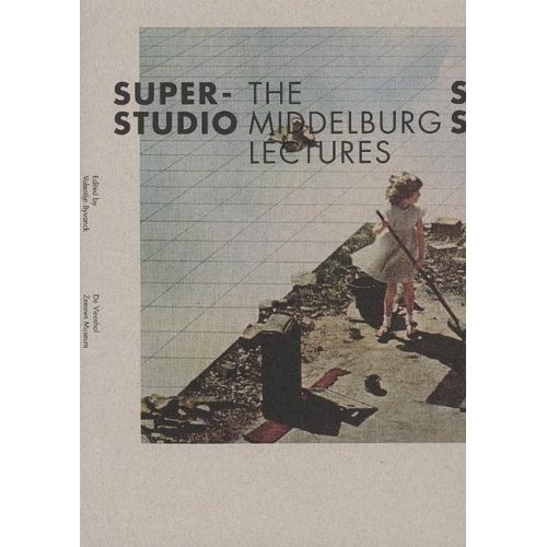
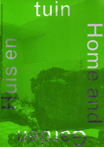
Do you know what I’m tired of? Really bad cover art. I understand that when you run a small press you have limited funds and can’t pay some brilliant designer, but IDK, if you can’t create something new at least copy something good. I’m an aesthete and have no problem admitting that if a book has an awesome cover & i’ve never heard of it, I will be more likely to pick it up. Hell, if a book has an awesome cover and is some weird mathematical exploration of space I will pick it up and read it even though I formerly had no interest in mathematical explorations of space, etc. Here are 35 book/magazine/pamphlet covers that (I think) are better than most things in the world: