Jimmy Chen—
Faith No More used to be “Faith No Man,” which was way more awesome; The Cure used to be “Easy Cure,” which was lame; Motörhead considered the name “Bastard,” which would have sucked; Oasis used to be “The Rain,” which was totally stupid; Pink Floyd used to be “Tea Set,” then “The Pink Floyd Sound,” then “The Pink Floyd,” until finally just Pink Floyd, which is understandable; Pixies used to be “Pixies In Panoply,” which sounds retarded; Queen used to be called “Smile,” which seems about the same level of okayness; Radiohead used to be “On a Friday,” which was really stupid; Van Halen used to be “Mammoth,” until David Lee Roth suggested the former, which is surprising because of their ego war.
54
Jimmy Chen—
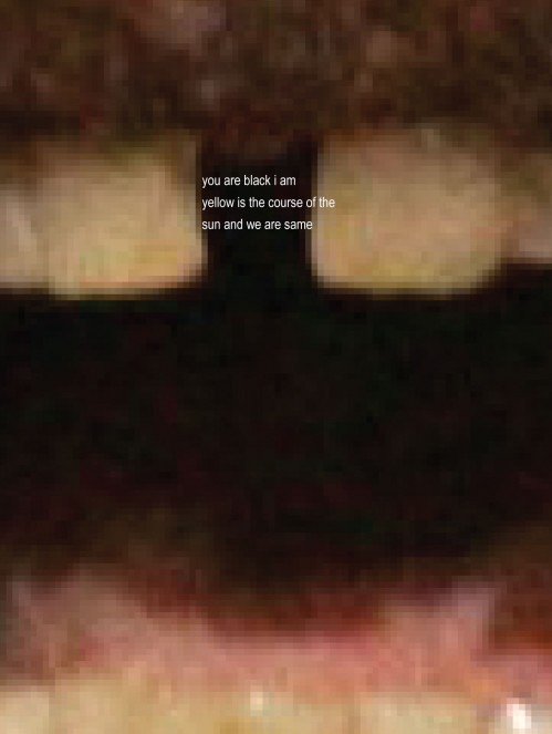
Sorry but I wrote a haiku between Cornel West‘s front teeth, seemed like a good place for one.
Other lame posts
Postmortem examination; postpartum syndrome; postmodern art; post traumatic stress disorder; post apocalyptic movies; post nasal drip; post baccalaureate unemployment; postcard from ex-girlfriend; New York Post; Post, TX; Post cereal; post office.
From syntax to ego to erasing Rauschenberg

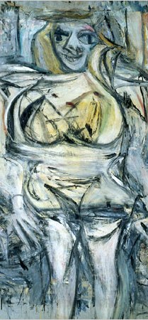
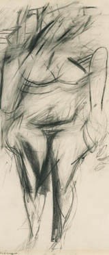
Whoa, wikipedia’s bracket illustration totally brought to mind de Kooning’s Woman series, in which the female figure is broken into a kind of provocatively aggressive male syntax. This post is not an invitation to the feminist angle, however called for, as the gestural implications are obvious; this just got me thinking about “Erased de Kooning Drawing,” (1953) by Robert Rauschenberg, who, then a young artist, asked the patriarch if he could erase one of the latter’s drawings, who, in the spirit that marks a great man, said yes. The result is beautiful on all counts, and proves that ego is never destroyed, only transferred from one artist to another. I see my surname in his, so in the spirit of self-abnegation, Mr. Rauschenberg, I ask if I may erase you?
Friday Fuck Books, Let’s Get Atonal Avant Garde 2x animals 2x human
httpv://www.youtube.com/watch?v=89Kz8Nxb-Bg
Kevin Sampsell Week (5): Unedited Cover
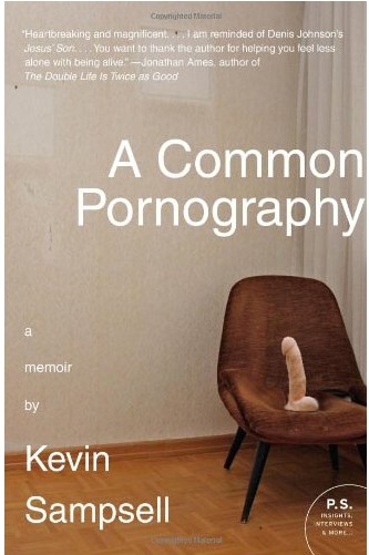 The original cover for A Common Pornography included “Hank,” a harness compatible silicone flesh-tone (Caucasian, wtf!) dildo resting in its intended vector on a retro 70s wool lounge chair. Sampsell, who gave up minimalism when they said “negate the wieners,” propagated his living quarters with various intra-orifice objects, though he prefers to name them after country singers. “Johnny Cash,” a real doll who looks strikingly like, well, Johnny Cash, is not pictured, but lies supine on the floor outside of the camera’s frame. Thanks to Sampsell, Cash’s plastic sphincter is now a “ring of fire.” Jonathan Ames, as his blurb will tell you, calls the book “heartbreaking”; what he fails to mention is that the heart is not the only thing being broken — so if Sampsell should sit down with a grimace for his next interview, please note that it is not any qualms of the mind which cause such facial strain, but rather tribulations of a more bodily, self-inflicted sort.
Brian Dettmer’s Altered Books
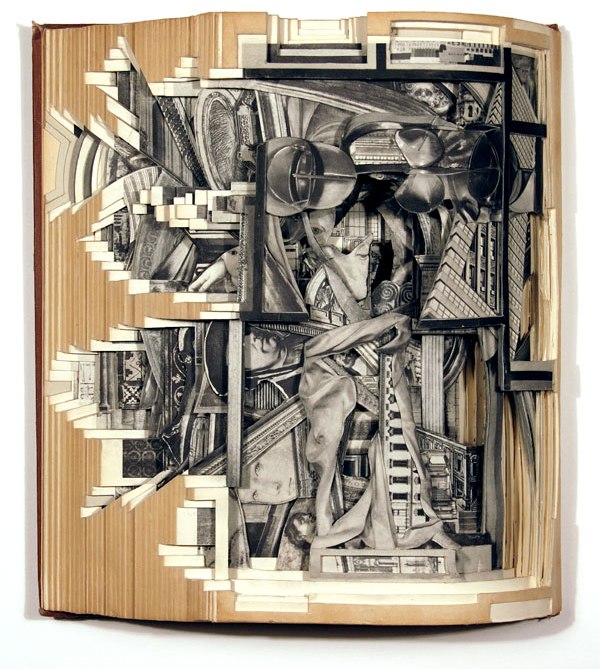
Brian Dettmer, "Key Monuments #4," Altered Book (2009)
I really enjoy Brian Dettmer‘s altered books, in which cut-out negative spaces inside books are layered together in their original binding to create, or more accurately, excavate, hidden visual and physical worlds. Gladly, the postmodern reflex of facetious appropriation is not the fancy here, but rather, a austere “classical” sense of intricate sculptural negation which brings to mind Michelangelo’s La Pietà or David, whose manifestation were through an aggregate of chronic and gentle subtractive layers. This idea of god or man buried under marble is similar to the newly discovered compositions buried, incidentally or arbitrarily, between the pages of encyclopedias and historical books. Put simply, the truth is in there. To see more, visit his flickr or website.
Power Quote: Kafka on writing
“It is, in fact, an intercourse with ghosts, and not only with the ghost of the recipient but also with one’s own ghost which develops between the lines of the letter one is writing and even more so in a series of letters where one letter corroborates the other and can refer to it as a witness.”
— Franz Kafka, from a letter to Milena
I suspect by “letters” he means, generically, the written word, though he could also be referring to letters, the medium with which he is writing to Milena — or, and this is my fancy, he could mean the letters which make up words themselves, thus dramatically altering exactly what is “[in]between the lines” and their respective “corroborations,” a funny yet telling invocation which hints at some complicity, as if writing is a shameful lie. His “intercourse with ghosts,” short of necrophilia, simply tells of a man who replaced love with words. (One should see desire in the pulp of paper.) Think about Kafka long enough, and you enter a dark tunnel. Don’t think about him, and your world too perfect, untouched.
Chris Ware’s New Yorker cover
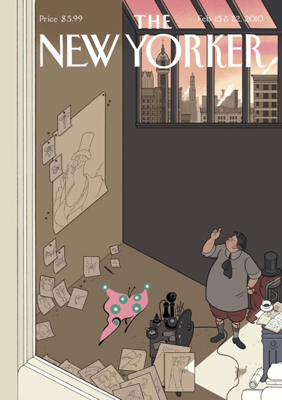
"Natural Selection" by Chris Ware, New Yorker, February 2010
Of the four covers for New Yorker‘s 85th Anniversary Issue, my favorite (while I appreciate all of them) is Chris Ware’s. He has a way of condensing large amounts of narrative into small hints or incidents; this is what I enjoy most about Ware: the visual riddles in his work. Eustace Tilley, as implicated by his top hat and green shirt — just a sliver, see it? — resting on his stool, is seen in a sort of aesthetic Darwinian tussle, unknowing of the prophetic butterfly outside his window, a lateral view which places us at the shared “fly’s butterfly’s eye” view. Check out the arc of evolution starting from from the wall: insects to arthropods to aves to primates, to eventually, Eustace himself. Ware’s sense of visual space is simply genius, his empathy abound. We see a pudgy Eustace in sock garters, cutting off his self-portrait just above the belly. And there on the floor rests the butterfly’s shadow, evoking a distance between our orientation as invited voyeurs outside the window and the space inside the artist’s studio. What looks like a self-assured “thumbs up” is, if we are to assume common draftsmen techniques, really just Eustace blocking out the affixed subjects with his thumb, still tentative, despite the cultivated naturalism of this wonderful scene, about what he will select.
Jimmy Chen—
Born Magazine’s “hyper” e-books [Example 1 | Example 2 | Example 3 | Example 4], self described as “cinematic and interactive interpretations,” are very impressive yet a little distracting. The traditional HTML versions — not because of content, but comparison — seem frigid, naked, unsure of their capacity. If the medium is the message, is the message that we’ve lost our faith in words? Or that we have some new killer software?