CF is a comic artist whose work, according to his blurb on PictureBox, “is marked by a precise, electric line and unique visions of parallel modes of being.” A fairly apt description. CF has been “blowing up” in the comix world lately, primarily, perhaps, as an artist working within the realm of “art comics,” a departure from the overly-stale “indie comics” zeitgeist that has peppered the cultural consciousness of the literate for the last two decades, slowly permeating the mainstream via film adaptations of Daniel Clowes and the McSweeney’s/New Yorker “reign of terror” brought about by Chris Ware and the ever-present Jimmy Corrigan.
CF’s major work has been his currently in progress Powr Mastrs, of which the first three (of a projected six, though I’m hoping it ends up being far more than six) have been published to major acclaim. I definitely recommend picking them up, as they’re beautiful books with insane stories that come from space, holding a sort of parallel early-80s Heavy Metal euro-comics narrative attitude with a specifically unique art style that CF himself pioneered (and is now aped to varying degrees, but as someone who likes the style, I’m mostly ok with that).
However, what I’m interested in today is a close-reading of a zine that CF created, CITY-HUNTER. Frank Santoro, another fantastic comics guy, describes the “zine” as follows:
Lots of backgrounds with “Main Dice” the main character swinging down the street. Lots of “straight talk” from the editor of the Fantasy Empire Magazine company. It’s like CF made his own b&w action comic and worried more about how the indicia and logo would look than the story – so it’s kind of perfect.
CITY-HUNTER was initially produced in a limited run by CF himself in 2010. PictureBox, who distributed the zine initially, printed a second, “expanded” run in a larger edition. I am a whore for CF’s work, so despite having the first, “self-published” version, I picked up the expanded edition. There are both advantages and disadvantages to the “expanded” version, but I’ll address that later.
My primary interest in examining CITY-HUNTER is due to my interest in the way books, or more specifically, I suppose, bound & printed matter, can work as a “zone of affect.” I am specifically interested in progressing the discussion of texts (whether they be movies, novels, poems, etc) which act more as experience than as representation of experience. Part of considering a work of art as experiential is a necessity of examining, and paying attention to, said work of art as a whole: this means, for me, when I look at books, I look not only at plot, but rather, the combinatory effects of the text as (literally) text, the way the text is laid out (the shape of the text, formal decisions regarding alignment etc), the size of the font, the way things are sequenced, the size of the book, etc.
So, first, let’s consider the format that CITY-HUNTER is presented within: the zine. Zines have, historically, played a part in the democratization (though I’d arguably prefer the term “anarchistic progression”) of information dispersal. Before the internet, tons of self-published/produced zines existed as a way for anybody with the initiative to get something they had to say out into the world without having to go through the channels of getting published in a magazine, whatever. A lot of progressive art and writing made its way into the world via this route, as well as ground-breaking/anti-academic critical theory & writing on architecture. There is an aura around zines, especially when considered in the era of the 1980s, that often marked the medium as subversive, and really, it is often a medium used to purport subversion.
Aesthetically, CITY-HUNTER also follows the aesthetics of the early 80s zine. The fonts are indicative of the time (the fetishistic attention that art-comic artists often pay to these aesthetic details is part of the reason the ‘movement’ is so appealing to me), the layouts appear to all be done by hand, and the values presented in the lights & darks are clearly values available only from photocopying images. “Cute,” you might say, “so it’s, like, retro huh?” Well, yes and no.
CF is not interested, here, in tapping into an aesthetic exclusively for the purpose of fetishizing it (though, as I’ve admitted above, that certainly does come into play). These instances of aesthetic insistence serve a specific goal, a goal made clear by the care in which they are presented: the zine exists within a realm of alterity: it is far away. Parallel to a mode of considering bands like Boards of Canada & those on Ghost Box’s roster, we can read this as an appeal to hauntology.
Let’s hear from Derrida:
To haunt does not mean to be present, and it is necessary to introduce haunting into the very construction of a concept. Of every concept, beginning with the concepts of being and time. That is what we would be calling here a hauntology. Ontology opposes it only in a movement of exorcism. Ontology is a conjuration.
The reason that the aesthetics work to help build a sense of atmosphere around a material object, in this instance, is due to the fact that as a signifier, each is subtle, underwhelming, invisible–unless you’re specifically looking for them. When an author/artist/whatever takes a mode of aesthetics (and this happens most often in regards to contemporary genre-movies that attempt to be “throwbacks” to the “golden age” of genre films, i.e. Grindhouse, Hatchet, etc.) and really insists on HAMMERING THEM OVER YOUR HEAD there is no gravitas so to speak; the bombastic attack removes any possibility of the aesthetic becoming a tone, and, rather, is simply a sign-post: you are TOLD this is a “throw-back” instead of feeling like the art is from another time.
So, right off the bat, a zone of alterity has been established for the work to exist in. The next thing to be noticed is what the zine, itself, lacks: nowhere, throughout the zine, is there any indication that CF is the author. The only names used, ascribed within “articles” throughout the zine, are presumably apocryphal; the text is virtually anonymous, presented exclusively under the guise of “Fantasy Empire Magazine Co.” What this indicates is that the author is not important.
Of course, for one familiar with CF, the zine is immediately recognizable as his work. But for someone unfamiliar, encountering the zine in an anonymous location (especially in the “first edition”), there is really no way to identify where the zine came from, even what year it’s from. Derek White (author & publisher of Calamari Press), recently blogged about the Voynich Manuscript, and the mutable ontology the book-object holds. He ends his first post with the following:
the «language» Beinecke MS 408 is written in cannot be deciphered because it is not a cipher to begin with—it IS the information—a direct reflection of how the information exists in a chemical or molecular or biological form.
This articulates a ‘mode’ of reading that CITY-HUNTER necessitates; a mode in which the reader is not trying to “decipher” the text, rather, an interaction with the text that accepts it as “a direct reflection of how the information exists.” What I’m saying here is, within the realm of CITY-HUNTER, author is not important: the zine itself is.
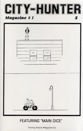
Opening the zine, the verso presents two panels of illustration: a man standing on top of an anonymous building, vague clouds in the sky, and a man on a motorbike next to a street lamp. The recto presents a “NOTE FROM THE EDITOR,” and the very first line is telling: “Some things are better left forgotten…”
Following this, the “editor” of CITY-HUNTER presents a casual explanation of “Hunting for the city IN the city…,” an adventure-club version of the Situationist dérive. And with this as introduction, the zine begins. Flipping pages reveals images of an anonymous city-landscape, with hyper-present geometries and distorted figures that can find no place in reality. We are touring a parallel world via the pages of this zine; looking at patterns and shapes, occasionally recognizing figures, satellites, cars. There are very prescient science-fiction overtones, but the root of these overtones cannot be identified outside of the alterity that holds its own throughout. Occasional pages resemble asemic glyphs, indicators of something, a meaning that cannot be translated into, perhaps, English, but remain in a realm of meaning qua meaning.
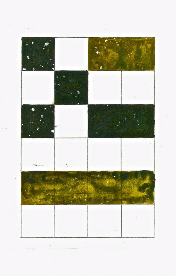
There are drawings of both interiors and exteriors, the first discernible interior titled “Mansion Soft Drinks” : high ceilings, draped windows, abstracted art on the walls (or are those vents, windows?), and a soft drink machine in the middle of a room. The next page is tiled squares, some blank with the white of the page, some colored in earthy blacks and vomit-tinged greens. It would be easy to dismiss most of the content as a simple aesthetic exercise, but regardless of whether or not there was authorial intent, meaning, so to speak, what is present, helps to generate & perpetuate the narrative space of affect that the zine occupies.
After several pages of “atmosphere” (included a blown-up xerox from USA Today that centers the word “Life” on the page), the zine hits what could be said to be the center, or the heart: a “comic” bearing the title CITY-HUNTER “MAIN DICE”. Within CITY-HUNTER, we have CITY-HUNTER. A tone has been established, so now we can view a depiction of the formerly mentioned “hunting for the city IN the city.”
A spread of four pages, with three panels a page, depicts various locations, we presume, that are found throughout the city. A man in sci-fi/militaristic garb stands by a convenience store that sells alcohol, a dark figure looks out a window (reminiscent of Huston’s 1951 cover for the English translation of Julien Gracq’s Dark Stranger), a hovering car floats near what are either trees or street-signs, two figures speak in a boundless & empty hall, a figure graffitis the words “MAIN DICE” next to a right-facing swastika along an industrial wall, and a figure stands on an observatory building next to a telescope.
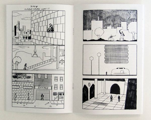
There is arguably no discernible narrative here, there is no dialogue. These panels do not work the way comics traditionally work. It is easier, I think, to consider the panels a montage of a dérive, a depiction of space. The city combines iconography of futuristic 8-bit culture with the architectural precision of Schuiten & Peeter’s Cités obscures. Through the medium of the comic, we are traveling, we are tourists.
The next page is a rough sketch of a mountain, an unidentifiable collection of shapes, block letters spelling out “BOOK,” and the expression “comet-ra[d]aton” (comet radiation?). After this, two pages of bondage pin-ups, women (?) tied up in Victorian-decadent interiors. For me these two pages draw a parallel between the archetypal setting of much French erotica (and in an interview CF declares himself a fan of both Georges Bataille & “Pauline Reage,” the latter the author of the quintessential Story of O) & the alien universe that has been constructed. This is a particular mode of narrative that CF is thrusting the work into without actually explaining anything. This is a shortcut for someone familiar with what the images evoke; for someone unfamiliar the pages can easily be viewed as pin-ups, something that would not be out of place in an 80s fantasy zine.
After, another landscape: we are getting an idea of the city through suggestion, we are shown key locations that permeate our own headspaces, letting us fill in what it is that happens in the city. Next, a collection of objects that recall Memphis design group, though in terms of functionality, we cannot recognize any utility.
The next two pages depart, stylistically, from what has come before: the verso a color photograph of an unknown person pissing onto a manhole cover (perhaps an invocation of the drabness of “city life” itself?), the recto a “Paid Advertisement” for CF’s now defunct blog. In the initial pressing the advertisement is just a screenshot containing the URL, but in the revised edition, the text “R.I.P.” is scribbled above the screenshot. The diegesis of the city itself is broken here, but we stay within the diegesis of the zine-as-artifact (what happens is similar to what happens in Inception, with its dream-within-a-dream shit– only here the reader herself has gone two layers “into” the diegesis, rather than just watching someone go two layers in).
After the ad, we have another text page, a “Guest Editorial” by “Mike Rennet.” The first paragraph begins:
In the city there’s only 4 things I would recommend – enough food, enough sleep, somewhere to live, and something to do. Love is not important in the city, it’s tainted. By what? Modernity. I think you know what I mean, and I don’t have to elaborate on that.
Mike Rennet is right: it is now that as a reader we remember the S/M pin-ups from a few pages back; the intersection of the pseudo-Victorian interior with a modern sexuality. The tone of Rennet’s article is that of a future-tinged neo-noir, the smokey voice that haunts the airwaves of late-night radio when everyone in the city is asleep. Only nobody ever sleeps in a city. And to make sure that’s known, the recto is a simple drawing of an isolated high-rise, dark outlines of figures populating almost every window. Everyone is there, but no one can be recognized.
The final four pages are busier than all the pages that have come before: a hodge-podge of ideas and acronyms and symbols and icons. In totality, we have a condensed spread of symbols communicating an idea. The word and the image have already been equalized, leveled, and we can read both simultaneously; we read them intertwining, creating more of the space of the city. A circle next to a “gelatinous cube” bears the scrawl “WHAT WILL HAPPEN.” Binoculars view a sewer. “Chance Rides High”…
And then we’re at the end. The experience is over. The back-covered features a line-grid crossed with diagonal lines, closing the cage on our aesthetic experience. The bottom right of the page identifies the zine from “Fantasy Empire Magazine Co.” again. In the original edition, a red stamp marks the back page; “FANTASY EMPIRE.” The reprint is not stamped. There are other minor differences: the reprint identifies itself as being from PictureBox, Inc on the cover, where the original insists on the apocryphal Fantasy Empire Magazine Co. In considering the creation of an object of affect, the original sticks to its guns. I do like the added pages of the expanded edition and think they work to extend the affect (the 4 additional color pages are nice). The original printing is gone forever, and since I have the reprint I’m tempted to leave the anonymous original in some disparate location, hopefully blowing an acne-loaded teenager’s mind.
I’m not going to end this by drawing a conclusion: all of my conclusions can be found within. Ultimately I think the zine is ridiculously successful in appealing to the qualities of an object that I would declare the future.
Purchase CITY-HUNTER from PictureBox here.
Tags: case studies, CF, CITY-HUNTER, PictureBox Inc, zone of affect
the paid advertisement is for jess ciocci’s blog, not cf’s. and it’s my understanding that it IS a paid advertisement. plus, it’s not defunct, it’s right there.
I was under the impression that it was cf’s blog when the first printing came out? I could be totally wrong though, obviously, as there’s clearly nothing on there now (nor was there then) that indicated “possession” so to speak. Plus I think by defunct you know that I mean it’s no longer in use, as all the old posts are gone.
this is one of my favorite posts.
i still need to read POWR MASTRS VOL 3
Not sure about Tim the bear. Sometimes I’m like yeah and sometimes… Mehhh
Thank you.
I had forgotten about this; ran to Quimby’s and bought it. Rad.
yeah i want this.
http://xrl.us/bh8tjk
She’s in Paper Rad
she is rad
I… probably should have known that, or at least bothered googling it, haha
[…] Note from Impossible Mike: Jon Clark contacted me after reading my Case Study of CF's City Hunter and introduced me to his work. At the time he was working on Spectrum Hunter, and seeing the final […]