Technology
Standing books
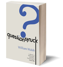
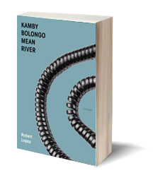 Books have been virtually standing up lately, endowed with a visual girth which reflects the meatiness inside. I like this idea, but it does make me wonder: why does a medium inextricable with 2D wanna play 3D? Is it a marketing thing? Like a representation of the actualization of having the physical book in one’s hands? Or is it simply the flourishes of photoshop’s capacities? Here are two books from Keyhole and Dzanc. One notices they are rendered with the same template. (I actually first thought they took a picture of the book.) I often wonder, “is the actual book that thick?” That’s a meaty 600 page-ish thickness.
—

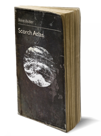 The version of Tao’s book seems completely digitally rendered, and one notices an ‘accurate’ page width. The shadow cast by the book is more rigid and flat, unlike the “real” multi-tone shadows created by multiple lights in the books above. It would be hard for the novella to stand by itself (literally, not a commentary). With Blake’s book, it seems Featherproof went out of their way to create a dog-eared and tattered template to reflect the book’s apocalyptic inclinations. The comprehensiveness and content-consciousness of this is remarkable.
Maybe this recent ascension of books to an upright 90° subconsciously borrows itself from a new way of reading, namely, with an upright 90° monitor. Seriously, we used to look at a downward angle; now we look straight ahead. What’s funny is that while all this is made for and presented online, the end point at stake is the ever lovable hand-held/lap-rested book (probably at an optimal ~33° – 43°).
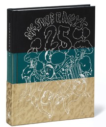 In the age of mimesis, it is increasingly more difficult to tell what’s a photo; what’s photoshopped; what’s a shadow; what’s a whatever. I’m pretty sure McSweeney’s here took a picture of the actual book, maybe photoshopping that shadow though. In basic drawing class, we learn that form cannot exist without its shadow. (Painting’s vector, like reading, is left to right. Chiaroscuro light is 99% left to right, with the shadow on the right.) With the Believer book reviews (I can’t find a pic), they do this nice weird thing of photoshopping the book with its cover ajar. Perhaps flat cover art is too hermetic, we need to be teased.
I remember the old days when a book was just its flat cover art — where I had to buy the book and hold it and read it; only then would its 3D world come to life. I’m not critiquing this new erect way, just saying it’s a little funny. Rene Magritte dealt a lot with the relationship between the represented and manifested. In “The Human Condition,” Magritte imposes a canvas on top of a landscape. The canvas is conveniently a painting of the supposed landscape it blocks from us. Of course, what is truly “convenient” is the actual canvas (the painting itself), not the depicted one. Magritte imposed his painting on top of a wall, blocking out a small rectangle of blank. I guess my point is: language is an imposition on nothing, everything is fake. A book is no longer just a book, it’s a picture of one — standing, eager to spread the truth-ridden glorious lies of its fiction.
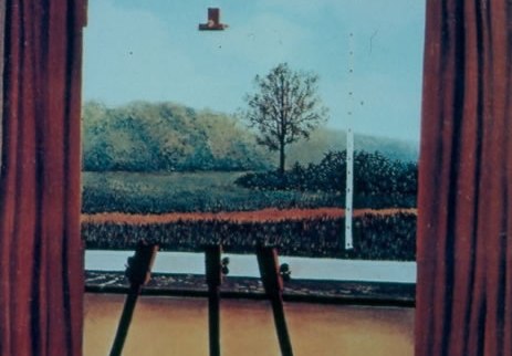
"The Human Condition," Rene Magritte (1933)
Oh, and speaking of photoshop, you suck at photoshop — proof again that genius is often found at home.
httpv://www.youtube.com/watch?v=FRnrKzOrp7M
Tags: Book covers, photoshop
I worry about that…I had page count on there at one point but did editing and forgot to include. Need to add that back in. Oh and I just think the standing book thing is pretty
I worry about that…I had page count on there at one point but did editing and forgot to include. Need to add that back in. Oh and I just think the standing book thing is pretty
Dig it.
The standing book thing is odd. They always remind me of little people. It’s odd, but pleasing.
You Suck At Photoshop is hilarious.
Dig it.
The standing book thing is odd. They always remind me of little people. It’s odd, but pleasing.
You Suck At Photoshop is hilarious.
This entry is the perfect example of why Jimmy Chen is my favourite contributor amongst the giants of HTML.
But please, Jimmy, knowing your fondness for fonts, could we next have an analysis of contemporary book cover typography?
In your own good time, obviously. Though soon would be nice.
This entry is the perfect example of why Jimmy Chen is my favourite contributor amongst the giants of HTML.
But please, Jimmy, knowing your fondness for fonts, could we next have an analysis of contemporary book cover typography?
In your own good time, obviously. Though soon would be nice.
I know what you mean, Jimmy. Not sure what compels people to find the standing book more pleasing, but it seems like most people prefer it. I started doing it on the Dzanc site last year, and a lot of people have asked me about how i did it, where I got the photo, etc. I’ve done flat cover images since then, and people always ask “where’s the 3-D cover?” So, I guess it’s a trend that is catching on, especially among the small presses.
I know what you mean, Jimmy. Not sure what compels people to find the standing book more pleasing, but it seems like most people prefer it. I started doing it on the Dzanc site last year, and a lot of people have asked me about how i did it, where I got the photo, etc. I’ve done flat cover images since then, and people always ask “where’s the 3-D cover?” So, I guess it’s a trend that is catching on, especially among the small presses.
the 3D standing book appears realistic or tangible. like a person could reach in and pick it up.
marketing is interesting. it is fun to read about how weak and stupid we are as human beings.
the 3D standing book appears realistic or tangible. like a person could reach in and pick it up.
marketing is interesting. it is fun to read about how weak and stupid we are as human beings.
hah hah, jereme, you always make me laugh, you crazy sack of shit!
hah hah, jereme, you always make me laugh, you crazy sack of shit!
thanks vaughan. i did something on fonts a while back, but not on book covers specifically…may do that too.
http://htmlgiant.com/?p=2665
thanks vaughan. i did something on fonts a while back, but not on book covers specifically…may do that too.
http://htmlgiant.com/?p=2665
this is a can of design worms, which once open, could involve me typing all night and revealing how dorky designers really get.
blake’s book comes like that. but only for the next 4 days. heh.
a side note: a lot of designs that look great on book covers don’t look so great as tiny jpegs, which, 3D or not, is really what book cover design is becoming in the internet age.
this 3D template has jumped the shark. i’m going to figure out how to make them holograms…