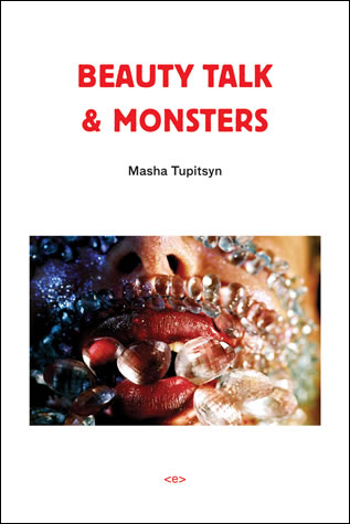
20.5 “Books” I Found Especially Beautiful in 2013
Johannes Göransson said on Facebook that one thing he doesn’t like about the “list”-based idea of criticism is: “that you can’t challenge it. You’re not allowed to say: No this list is mediocre or whatever. Then you’re not a nice person.”
Here’s a list of books I’ve only read four of but find especially aesthetically pleasing. Be a nice person.
***
Brandon Brown – Flowering Mall – Roof Books

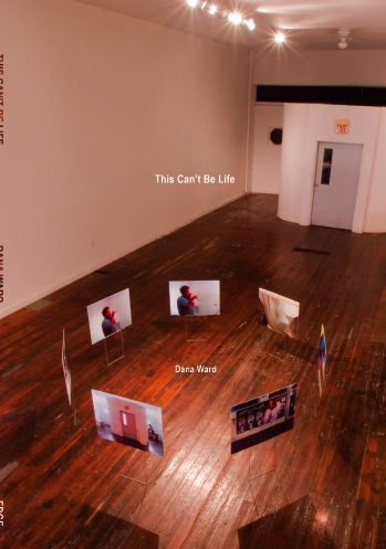
Dana Ward – This Can’t Be Life – Edge Books
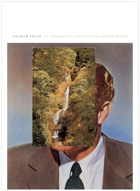
Graham Foust – To Anacreon in Heaven and Other Poems – Flood Editions
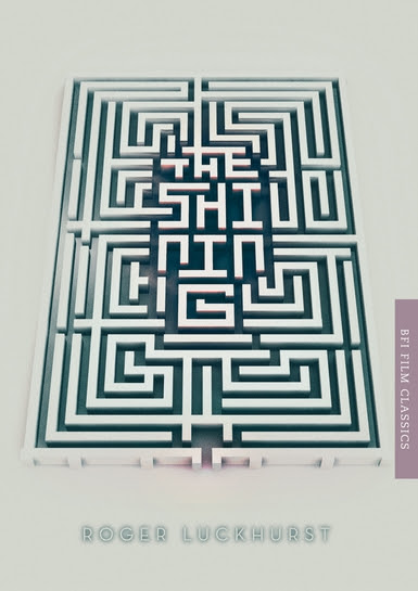
Roger Luckhurst – The Shining – BFI Publishing
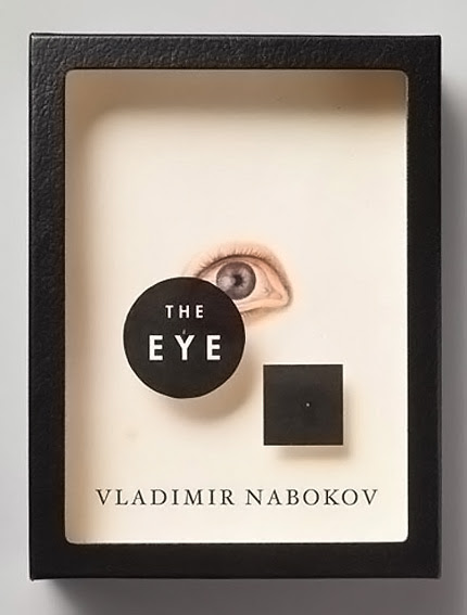
Vladimir Nabokov – The Eye – Vintage


Don’t write all over the goddamn books please.

I hate blurbs on book covers, at least put that shit on the back if it’s all you can do you think you have to to sell your shit and maybe you’re right, I’m no good at selling it. A terrible telemarketer, I would probably make a mediocre regional fertilizer salesman, which is to say I would be shitty at selling shit. So you go on building bridges and stuff. I mean I get it. It’s silly but I’m better at burning them britches. What I like is to consume my brain food from a plain colored box, like an Oreo milkshake, or expensive yogurt the way Muslims frown on figure drawing in the mosque. I think that’s rad. Frown away Mohammad. Patterns are whatever. Pyramids are when. They are good to think on I think. I like to gaze at them and think on Gawd oh gawd the stars the trees. But my kind of cover is a naked Knopf hardbound from the 60s. Maybe I’m boring and probably it’s vain but I don’t want other people’s opine opinions influencing my internal dialogue, not until I’ve digested my lunch which is to say eaten the text the film the album the thing and pooped out an opinion of some kind, however odd it might look oblong and oblique, not until I’ve had time to play with it to prod it to scrape and slice it beneath the blade of my tongue. But I like first for a thing to be in space like a rock in the ground pulsing tight 600 million miles a fucking hour going this is True btw, and then to have it there in my mouth in my ears my eyes huge like a fresh batch of fungus, a bunch of firecrackers going off in my bulb my skull my head. My favorite thing said in French is J’ai mal à la tête. To think of it rolls off the tongue like butter on bread.
Salute to Salu
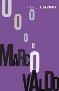 Caustic Cover Critic interviews Michael Salu. Salu just did the Vintage Classics’ Italo Calvino and Raymond Carver reissues. His blog here.
Alexis Orgera—
Very Short List just sent me a link to a site that chronicals reusable cover art in historical novels. I am strangely and inexplicably fascinated by the recycling. I think it’s John Berger in Ways of Seeing who talks about how reproductions have changed the way we see art. Repetition as its own artform. I’m sure a boatload of folks have made that observation, come to think of it.
What about the book called Kleopatra and the one called Scheherazade with the same black-veiled woman on the cover?
18
Matt Bell—
The Book Design Review blog has posted their Favorite Book Covers of 2009. Which others did they miss? What was your own favorite cover of the year?
A book by its cover


It’s funny how publishers convey to their readership how tedious and non-pleasurable a book will be based on the lack of color on the cover. Stick some guy’s grainy face on there and consider the suicide pact signed. In my indulgently dour youth, I would only read books with grim black n’ white covers, thinking that such monochromatic plight was “deep,” and that I was similar to those intense and austere men in our refusal of hue. True, many of these books and their designs happened before color photography, but it seems most of the incidents were retroactive.
Standing books

 Books have been virtually standing up lately, endowed with a visual girth which reflects the meatiness inside. I like this idea, but it does make me wonder: why does a medium inextricable with 2D wanna play 3D? Is it a marketing thing? Like a representation of the actualization of having the physical book in one’s hands? Or is it simply the flourishes of photoshop’s capacities? Here are two books from Keyhole and Dzanc. One notices they are rendered with the same template. (I actually first thought they took a picture of the book.) I often wonder, “is the actual book that thick?” That’s a meaty 600 page-ish thickness.
Cover War / Color War
(via Bookslut) Justine Larbalestier speaks at length about the problems she had with the US cover of her book Liar, a YA-adult crossover novel about a black teenage girl, that somehow wound up with a vaguely emo white girl face on its cover. Justine’s restraint and professionalism is remarkable. Quite a bit more of both than I’d have likely demonstrated in the same situation. The essay is a well-thought, engrossing exploration of the cover-choosing process, which is a bizarre mating ritual few people who have never been through it (or put someone through it) know very much about. I myself have just been through it for my story collection. Harper Perennial, btw, were super-responsive to my ideas, kept me in the loop at all times, and I’m counting down the days, minutes, seconds until I can show you what we came up with. They are amazing and just thinking about them–especially Michael Signorelli–makes heart bubbles float all around my head. But back to Justine. Another fascinating part of her story is how the whole whitewash experience stirred a change of her heart with regard to what the cover ought to be. Whereas originally she wanted the US cover to look like the Australian version, which is a sweet piece of design with no faces or other human parts on it, this experience led Justine to start noticing how under-represented people of color are on book covers in general (also the way that “colored” covers are frequently either rejected by stores/libraries or else ghettoed off in the so-called “urban fiction” section). Consequently, she seems to now feel strongly that the cover of the paperback edition of Liar should be representational, and depict a young black woman who resembles her main character, hopefully so young black women like her main character will see something they identify with when browsing the largely and unforgivably white shelves of the YA section. Here’s hoping she gets what she’s after. PS to Bloomsbury, if anyone in editorial/PR is reading this: we don’t usually cover YA, but if you give Justine the cover she’s gunning for, we’d love to hear about it / see a copy.
Fun at the bookstore
I was hanging out at a book store (had 4 hours to kill, girlfriend induced) and started noticing a lot of similarities and relationships between the book covers, so with a little (just a little) manual intervention, captured some moments I’d like to share.
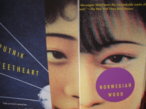
Most of Murakami’s book covers feature some 50s-type Japanese lady, especially her eyes. I’m sure the art directors at Vintage are aware of this — just not so sure if it’s some default passive motif or if there’s a broader concept to this. True, women are an evocative concept in his books, but I don’t think so much to warrant almost every cover.
Uncategorized / 26 Comments
July 20th, 2009 / 2:14 pm
July 20th, 2009 / 2:14 pm