MLP: 3 Reviews
I got the second batch of Mud Luscious Press chapbooks today, and read them excitedly. J.A. Tyler (editor) chose bright neon colors which, for me, reflected a certain kind of synthetic violence I found to be a unifying factor.

Rat Beast by Nick Antosca
[Spoil alert] This piece starts off fairly ‘normal,’ a first person narrative about a dour kid turned teenager having trouble at school. A Huxleyian counselor enters with treatment alternatives, the final of which takes a rather grotesque Kafkian turn (two name-drops, sorry), towards the eponymous animal. The ending is even more evocative due to the well-handled restraint in the writing.

Patience by Brandi Wells
A man carves the female reproductive system in the rind of an orange, creating a fetus in place of the fruit. At one point he “carves a fist beside the labia,” an allusion (in my sick mind at least) to fisting, or at least the manual ways women’s bodies are altered by patriarchal ideals (I’m so gay). Wells describes fallopian tubes wrapping around blades of glass and ants eating them; a kind of abortion detritus. J.A. Tyler plays well with the physical page break, embracing the most precious (bad word!) moment of the story.

In the Rape Year of the Ghetto Toddler the Houses Will Awaken by Blake Butler
To try to understand the title is to try to understand Butler’s writing, and I mean that in a good way. Butler is concerned with ideas, themes, and language–and how those three things cook down into meaning. He doesn’t explain it; but describes it, and he trusts the reader and himself enough to know that, through the thick confusion and minor nausea, his writing will be intuitively understood, and more importantly, viscerally manifested. Herein, rabbits live in bacon-greased arm sockets, wallpaper patterns dent cheeks, and a man is on vacation his whole life. Unabashed controlled chaos. Through the surrealism, I always get the feeling that Butler is talking about something less metaphysical, and more actual: an America today that might cause one to dry heave.
On a formal note, J.A. Tyler is marking MLP chapbooks with a signature ampersand in place of all ‘and.’
& it rocks.
Underland Press, Blind Items
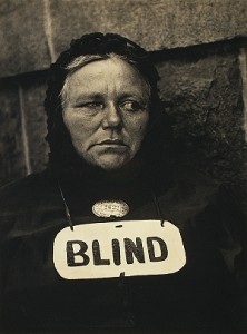
One: Blake mentioned the Brian Evenson interview on the Underland Press site. On the Extras page, you will find a really nice, beautifully brutal piece of fiction by Our Fearless Editing Leader.
***
Two: I would like to reboot my Blind Items feature. Please send indie/literary rumors, news, innuendo, and suggestions to giantblinditems at gmail dot com.
Anything, really. Send it on and I’ll consider spreading it.
Intelligent Design
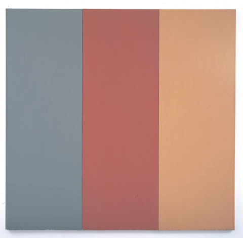
Pre-Morgan Brice Marden
An article published by The Chronicle of Higher Education discusses online ‘literacy traits,’ put simply, the lack of reading online. Myspace and facebook have turned the human race into a thumbnail. Of course, those of us here are in the old fashioned business of words—being writers, editors, and avid readers.
I will admit, I need to be somewhat invested in the prospects of reading a piece over 1500 words to print it out and read. My onscreen limit is usually under 1500 words. I’m occasionally frustrated when I can’t print out a story due to the web-file’s printer constraints. This got me thinking about various aesthetics of online journals—how editors/designers deal with not just internet’s short attention space, but the visual encounter with text, as the latter effects reader’s tolerance.
Seeing white words on a black background induces dizzy spells. It’s like looking into a congested night full of large ass stars. I much prefer when the words are deeper in tone on the gray scale with a black background. The classic black words on white is somehow the logical default to mimic the printed page, though I find black words on muted backgrounds (Hobart, Pindeldyboz, Juked) a little easier on the eye.
Margins are also a big deal-breaker for me. When there are no margins, and each paragraph stretches across the screen, it looks like some diaspora of abandoned words. In the end, you need to either mimic the printed page, or invent an aesthetic conducive to the screen.
This brings me to Bear Parade from our own Gene Morgan, and as of late, Lamination Colony by our own Blake Butler.
Bear Parade’s design IS the internet. It doesn’t need to mimic the printed page—in fact, it exploits the very qualities only possible on screen. Most of the stories in Bear Parade employ a ‘triad of tone’: 1) background color, 2) text color, and 3) rollover link color. The last one (3) seems almost incidental, but it’s a little blessing each time I rollover. It completely seals the context of the other two tones. Morgan is a rare colorist and designer; his choices are humble, sophisticated, and—perhaps most importantly—embody the tone of the story itself. In Small Pale Humans, readers might (just might) discover the faintest silhouette of a cactus, as if seen under the dimmest moon. Morgan tells a story with mere tone. He puts the zing in amazing.
Lamination Colony’s concerns are not so much about color (though the template light purplish page is deft) but self-conscious placement of text and imagery. The Woman Down the Hall is one of the most beautiful artifacts online. Each transition (the closest word I can summon to describe a ‘chapter’ in e-book scale) is an epiphany. Butler introduces a cinemagraphic element to journal design: fragmented and uncanny visual narratives—an intuitive evolution, given his self-professed Lynchian tendencies. My favorite transition is when an old woman’s face is followed by an extreme close up of the face. Butler draws the reader in closer, deeper. In another part, a small sentence is wrapped around like an egg, positioned perfectly on top an ominous source of light. Text also wraps around teeth. The guy is mad.
Some of you may accuse me of ingratiating myself to the editor and designer of this website. To that I say: I would say such things even on a desert island, holding a coconut, and looking for a bowling alley.
Uncategorized / 30 Comments
October 7th, 2008 / 2:36 pm
October 7th, 2008 / 2:36 pm
i randomly selected a journal off of blake butler’s sidebar because he is cooler than me and then i edited the journal’s “about” page
well, as i explained in the title of this post, i selected a journal at random from blake butler’s sidebar. it was “caketrain”. i went to their website and edited some of the text on their “about” page.
here it is:
Caketrain is edited by A CHRISTMAS TREE and A HAMMER, who cofounded the project in 2003. In short, we (A CHRISTMAS TREE and A HAMMER) found ourselves realizing that this “crazy” passion-for-the-arts thing, which had long been fostered in all of us, was not going to be muffled by EVIL WHITE PEOPLE, or logic, or PRAYERLESS ASSASSINS SLEEPING IN TREES. Yes, the drive was here to stay, and we had HERPES; fortunately, we shared these HERPES with one another, and together, turned them into a journal and press (AND ITCHY GAPING SORES ON OUR LIPS AND GENITALS). Many have taken this route before, and we are proud to be accepted into their number. All of us—readers, writers, editors, and PEOPLE WITH HERPES alike—are engaged together in the struggle to stand our ground in a larger landscape in which literary daring is marginalized, ghettoized on small, out-of-the-way shelves where it sits unnoticed, unread, and ultimately forgotten (BECAUSE IT HAD WICKED HERPES AND STUFF).