A few months ago I started receiving press releases from them. They’re a new electronic magazine that promise to “feature the best of small press, university press, and self-published books.” Okay, cool, I was excited that a group I had never heard of was doing something that could be so monumental for indie lit, which is like my main deal. And they’re thinking big, I noted from the first of the three points they said would interest me, which was that they’re offering a free copy of the first issue to the first 10,000 people who request them.
To break that down, the two things that impressed me are READ MORE >
This is the third version of the site in as many years.
We did some basic formatting to the posts.
We added TypeKit fonts to the site, because we were tired of looking at web-safe fonts. TypeKit is shitty on the iPad, so everyone there and the people on shitty and weird browsers will get to look at Impact and Gill Sans. Everyone else gets Chunk and Ratio.
We made the site “tighter” with less empty space. It’ll look good on your phones and fit on whatever screen you’re using, hopefully.
We added a Disqus commenting system, because the comments are a little out-of-hand. It is more complicated than the previous system, but has the potential to make things less anonymous, which I like. You can seem more like an actual person to me.
The ads at the top are for independent publishers only. The ad slots are $30 each, and there are two in each of the five spaces. We wanted to keep this cheap, for the people we love.
There are a few other things, but I’m tired.
There are a few more changes in progress, so if you notice irregularities, that’s probably why.
I hope you enjoy the site. It should be nice for a little while.
Special shout-out to Jereme Dean, Blake Butler, Jimmy Chen, Ryan Call, and my wife for help with the redesign.
If you have any questions, please email me at gene@htmlgiant.com. I’m here for you.
*Update* Disabled TypeKit on Windows machines until I can make it look nice. For now, only Mac users have pretty fonts.
Hi everyone, we’re about to go dark for the night. We’ll be a whole new HTMLGIANT (with new sponsors!) when we come back. In the meantime, why don’t you enjoy a refreshing Pepsi product?!
Two questions. When Witz came out, it felt like a lot of people were obsessed with the length of the book at 700 pages, as if the length were an insurmountable obstacle. Jonathan Franzen’s Freedom is about 570 pages long and way heavier because it is an infernal hardcover book, and yet I don’t hear a lot of chatter about the length of the book. Why is that? I hate hardcover books. When I say hate, I mean I react irrationally to them. Holding them makes me want to punch something. It’s uncomfortable especially because I am reading Freedom right now and it literally pains me to hold it. I should have Kindled it. Does anyone else hate hardcover books as much as I do?
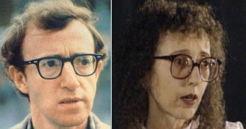
There’s a Woody Allen joke where he and a woman mutually undress in a hotel room, until he, without his glasses on, realizes he’s standing before a mirror. That woman, if there ever were one, would be Joyce Carol Oates, also near-sighted and pensive, self-conscious with dour eyebrows. Of the life-size bronze statue of him in Oviedo, Spain (a town he featured in Vicky Cristina Barcelona), let us hope he doesn’t undress before it. He also said “Don’t knock masturbation, it’s sex with someone I love,” which Joyce read as a rejection that fateful night in that hotel room, leaving her with nothing but time, and that chest-sinking task of writing too many novels to count.
 Hi everyone, we’re about to go dark for the night. We’ll be a whole new HTMLGIANT (with new sponsors!) when we come back. In the meantime, why don’t you enjoy a refreshing Pepsi product?!