Macy Halford at The New Yorker Book Bench blog rips off (oh, okay, perhaps we’re talking parallel development here, as they say in the movie business) HTMLGIANT’s Haut or Not feature in a new thing called The Subconscious Bookshelf. In fairness, the Book Bench feature seems more oriented toward analysis, while HTMLGIANT was just plain old judging you. Anyway, I think HTMLGIANT readers (and contributors) should submit to The Subconscious Bookshelf…could be very interesting. What are you waiting for?
BEST MOVIES OF THE DECADE (THE NEW YORKER’S AND MINE)

Dale Peck as a child
And here’s Denby’s list of the best movies of the decade. The only ones that I really love are There Will Be Blood and Caché (even if it’s probably in my top 20 rather than top 10). He also includes The Diving Bell and the Butterfly, which I had extreme difficulty sitting through. I don’t care if the movie is about a guy who’s lost the use of his body and can’t even really open his eyes. I don’t want to spend the first twenty minutes looking at a lens smeared with Vaseline.
My list, which you should feel free to dismember, is after the jump.
READ MORE >
HTML GIANT MARKETING CAMPAIGN
In effort to increase unique daily visitors (and I’m not talking about in-call escort services), HTML GIANT will be employing tactics used by the following masters of marketing. It is our hope to usurp these kings of literature/publishing.
***
[To do list]: Become vegan, get ‘severely depressed,’ attract ‘emotionally traumatized’ ‘females’ to make t-shirts and short ‘films,’ strive towards a ‘detached yet ultimately life-affirming’ philosophy, decrease pain and suffering, change font to ‘helvetica.’
***
[To do list]: Use exclamation points to convey enthusiasm! Sometimes three!!! And fragmented sentences. Like this. Use quirky/informal language to describe institutional matters: “we really like the internet, we even use our server as a lunch table, and we spilled fanta on it.”
***
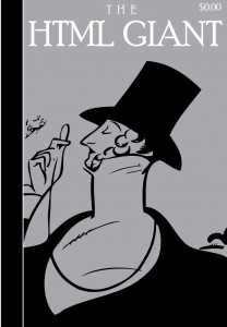
[To do list]: Help shape Malcolm Gladwell’s fro, send writers to France or the Middle East, advertise Prada and Chevron on the back cover, incinerate slush-pile daily, publish anal instead of annal, insert subscription postcards every other page.
***

[To do list]: Google ourselves every day hoping to be mentioned on some blog.
MEAN MONDAY: Aggressive Suitor
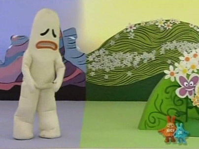
Got a special email last night from some dude, titled ‘Yeah, you.’ Uh oh.
Here’s what it had to say:
What’s up with your dead dick website? The motherfucker is cut-off on the left. Were you cum drunk when you designed it? Anyway dildo breath, here it is with your fake ass tough talk; What the piss is the pay for publication in your magazine? Most lit mags list it, why should I need to contact you about it? List it, Goddamn it! Do it NOW!! I write stories that make Hemingway, Fitzgerald and others of their ilk look like candy asses, suckling at their momma’s tit. I don’t have time to be coddling dirt dumb editors who can’t even layout a guidelines page – wake the fuck up!!
Christopher Roberts
I was able to find one online piece of work by Christopher Roberts, who writes stories that make Hemingway, Fitzgerald and others of their ilk look like candy asses, which is an an essay criticizing the closed-mindedness of the New Yorker (ironically at 3:AM Magazine). Bone crushing.
I’m not sure which way I offended Mr. Roberts, as I haven’t been able to link him to any of the journals I criticized the design of during Mean Week.
I did find him stickin’ it to the man from the inside on some writer’s publicity group called writers.net. Here’s his profile:
Chris Roberts
Agent: Writers net sucks
Brooklyn, New York, United StatesEmail: croberts7@nyc.rr.com
I live to run Writers net out of business – it’s run by a bunch of blowjobs.
Interests: Serial Killing.
Published writer: Yes
Freelance: No
Salivatory.
Anyway, to answer your question, dude, you must not have paid close enough attention to the ‘guidelines’ on our site (I assume you are talking about No Colony, though I’m not quite sure how websites can be ‘cut off on the left,’ does your monitor load backwards?) but let me point you to this thing right here on the front page:
We accept cash, credit, money orders, New Yorker subscriptions, and some forms of primitive coin or manual stimulation.
Now if you’ll excuse me, I’m on my way back to quivering in the vast throes of impending serial-killer-narrative innovation.
Good luck!
A JPEG PAINTS 1000 WORDS

The photos which accompany Pequin’s stories are always stunning, and as much as I advocate the breadth of words, I think they augment the stories.
Steven Coy (editor) has explicitly cited Lee Klein’s eyeshot for the image per text inspiration, the latter whom understandably didn’t cite New Yorker for having always done the same. In the New Yorker, the pairing of image and story seems conceptually unconscious. (I’m sure the politics of publishing both story and image takes precedence over any editorial ideology, if any, concerning the pairing.)
Eyeshot’s photos are quirky and playful, but they are somewhat detached from the story itself, and celebrated more for their inherent attributes. Coy is onto something different here. The photos at Pequin act as a kind of surrogate or residual ‘scene’ for/from the story; either that, or as a clever visual pun.
For example: Dream Date, about a not-so-great boyfriend and his girlfriend’s unmet needs, is accompanied by a scene looking down a pink stairwell into a dark hallway, a composition which shares the orientation of a woman’s spread legs. There’s even a light bulb (anatomically consistent) which supposes a clitoris.
In Animal Parade, a story about the mishaps of taking a wrong exit on the freeway, the image is of freeway periphery (cinderblock walls, telephone polls, fastfood signs, etc.). The photo has a way of snapping into POV function, embodying the view of characters in the story.
Per Pequin’s writer’s guidelines, stories are to be under 1000 words (ideally exactly 1000 words). Coy seems hell-bent on toying with the whole ‘picture paints a thousand words’ thing. Good for him, and good for us.
October 2nd, 2008 / 3:40 pm
