Craft Notes
Notes on Design: In Praise of Ragged Edges
I am a largely self-trained book designer. I hope to someday have the time to take formal courses in design, but for now I do my learning by studying the books I read. This means that often I will come across a convention in book design that I simply do not understand. These conventions are not universal, but they are common. Indie and major presses seem to agree, for instance, that text should be blocky. In fact, the text of this website is mostly blocky.
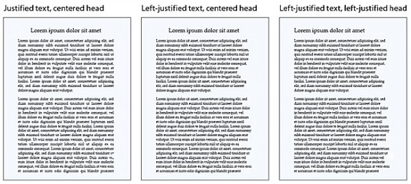
What I am talking about is justification. At some point, nearly all the book designers in the US got together and decided that the proper alignment for prose was left-justified. What does a left-justified paragraph look like? Well you are reading one now. The left edge of the paragraph is aligned with the left margin, and the right edge of the paragraph is aligned with the right margin. The last line of the paragraph breaks this rule, because it would require extreme distortion of the text to ensure it met the right edge (the last line might be, after all, just one word long, and we don’t want to see that stretched all the way from left to right). But here’s the thing: essentially every line has to be distorted at least a little to make the edges match up right, and once you see this, it can be very hard to un-see it. The spaces between words and individual characters swell and shrink according to the needs of the line. You may find yourself struggling to read an especially crowded line; you may find yourself wondering why the spaces between the letters in the word “between” are so big. Words that disrupt the shape of the text too much become hyphenated in order to stop them from causing trouble. Sometimes they even split across two facing pages. Sometimes this is not disruptive. But sometimes it gets very ugly.
I don’t understand the necessity of justification. Mostly I practice it in my own designs, except in the case of my magazine, where I decided to indulge my own particular aesthetics (with the exception of two pieces I thought looked better as blocks–one of the other indulgences I allow myself is significant variation in layout and style from piece to piece within a single issue, which is generally considered a bad idea). I justify text in most of my designs because because readers expect it, and because writers do too. It seems to be a mark of the amateur to allow a ragged right edge (i.e., the results you get from simply aligning left in your word processor — i.e., the default setting of every word processing system ever). And there is, to be certain, a beauty to blocky paragraphs: a sense of unity, of intentionality, of care. Full-time professional designers with sufficient time to spend on tweaking the kerning of line after line of prose to achieve graceful justification can often make beautiful books.
But most of the time, justification is not actually beautiful except at the most superficial level. When you aren’t reading the words on the page, it almost always looks nice. Once you are reading those words, it tends to break down. And I would argue that it actually reduces readability.
There are, as I’ve said, the distortions that justification requires in essentially every line of text. These are not just ugly; sometimes they cause small-but-real problems with legibility.
There are also advantages to the visual variation of a ragged right edge. The most perilous part of the reading experience is the journey from the right edge of a paragraph, at the end of the line, to the left edge of the line below. You know you’re reading a book or a website with incompetent design when you frequently get lost within a paragraph because the text is too crowded or the lines are too wide. My experience suggests that this journey from right edge to left, from one line to the next, is also facilitated by variation in line length. I personally have an easier time making this transition when the lines look different from one another. I suspect you might also.
Finally, hyphenation at the end of the line becomes significantly more common on a justified page. This isn’t only ugly, it requires us to pause mid-word, and make that perilous journey to the left edge before we can finish that word. This isn’t exactly challenging for experienced readers, but it doesn’t facilitate communication either — and marginal readers do matter.
It seems suggestive to me that absolutely no one I know has ever willingly composed a text with justification switched on. Microsoft Word defaults to ragged right edges — partly because its justification algorithm isn’t all that smart, but also because it’s easier to write that way. When you submit a manuscript to a publisher, you don’t send it to them justified, presumably because they find it easier to read with a ragged right edge. (I certainly do; I hate when submitters send justified documents.) Do the preferences of readers really differ that much from those of writers and publishers?
The primary advantage of justification seems to be that it represents a clear design decision. You have to choose to justify, and then you have to choose to take the time to tweak it enough to make it look good. It signifies competence without necessarily demonstrating anything of the sort.
I’m not saying we should never justify, by the way. Sometimes it genuinely increases beauty and readability — I started thinking about this today because I was doing the text design for a book that benefitted greatly from justification because it had so many small paragraphs and so much white space and was somewhat visually scattered as a matter of necessity. Justifying those paragraphs made the book look less haphazard. Justification can also be a useful aesthetic decision based on content: I use it in Exits Are because it allows me to simulate the somewhat crude, very computery visuals of text adventures without resorting to the ugliness of a more accurate fixed-width font. That’s also why the text is a bit green.
What I mean to argue is that I don’t think it should be the default choice. I think that we should consider alternatives depending on the contents of our designs.
And really, what I want is for someone to explain to me how this became the default in the first place.
Man, you guys think of me as the boring nerd now, don’t you. You have for a while.
Tags: fixed-width fonts, nerds only, text design, typography, ugliness
Mike, interesting article never thought about this before. But after reading and considering your question about how this became the default practice in the first place, the first thing that came to mind was Gutenberg’s Bible (which I had the pleasure of seeing when I was in Mainz). Of course this was one of the first texts ever made by a printing press and a quick google image search will show that these were all left-justified. I assume that this standard is a remaining artifact from early printing machines and how the letters were arranged on the chase.
Okay Mike, I’ll bear my typography dork soul too because unlike Nicholas, I have thought about this. I’m personally fascinated by the hold-overs from previous technology when it comes to typography and design. And I believe that’s the case here. In the early days of book printing the letters were actually placed into a frame – a rectangular frame of course – and it behooved the printers to fit as much into each space as possible. This was a cost issue because the unjustified text would increase the page count of the book. Now, justification is done programmatically, but then it was done by hand and by eye by the typesetter.
In today’s world of computerized desktop publishing there are many fascinating hold-overs from the various stages of the evolution of the printed word. One of my favorite examples is the use of the phrase “above the fold” in the web-design arena. That was a newspaper concept and yet still, when we talk about the immediately visual aspect of a web page we call it “above the fold.”
For some fascinating history of typography I recommend The Complete Manual of Typography by James Felici. See chapters 1, 6 and 8 in particular for history but chapter 10 will give you the most info re: hyphenation and justification.
And for the most elegant paragraph justification (when desired) one must use InDesign which is the only desktop publishing software currently available that justifies on the paragraph level, not the line level.
Thanks for the very interesting post!
and okay, Wanda Shapiro, i will bare my spellchecking dork soul, hope you can bear it –
; )
ps – i usually like dorks and nerds, being one myself
well, I was kinda right
And speaking of being a dork…. Gutenberg designed his Bible to look like a manuscript book, so my guess would be that the tradition of justification is actually much older then printing from movable type. A scribe would have had an easier time keeping their lines nearly justified, and saving space (parchment, and later, paper, were extremely expensive) would have been an incentive as well.
Justifying type when setting it by hand can very time-consuming–you have to go back and physically adjust the spacing between every word, often by a half point at a time, to get the type to fit to the set length. So while justification still probably saved paper in a printed book, it sure wasn’t any easier. Setting type with a ragged right edge is much faster.
Another thought–typographers often talk about the “color” of a block of type, which means more or less, how light or dark it looks as a unit on the page. Darker types are often preferred (legibility), and overall, a block of text will appear darker if all of the lines are set solid. There’s also the design consideration of the shape of the rectangles of the text blocks set into the rectangles of the pages. As far as legibility and the transition from line to line goes, the length of the lines and the leading between them are also very important. It’s always a matter of balance.
But as you pointed out in the post, this is all just traditions & conventions, and the design should work with the content. Jan Tschichold and other modernist typographers were huge advocates of a ragged right edge and asymmetrical design.
[…] words are mike meginnis in praise of ragged edges Share this:TwitterFacebookLike this:LikeOne blogger likes this […]
Justification is still an economic concern–you want to get your page count on a signature if at all possible, and justified texts are generally “tighter” texts.
This site – this very page – sports a mixture of right-margin designs: the blogicle is blocked, but the comments are not. –which works on reader-response sites to make the comments look… less official? less planned? more dialogical?
Not to deny the savings angle, but, contrarily to Mike, I think the block (justified right margin) design is easier to read, because the variably-extended (unjustified) lines are (for me) the distraction.
Also, the “distortions that justification requires” lead to less “struggling to read a crowded line” — because the lines feel less crowded when justified (by virtue of tiny expansions – as well as contractions – between words on different lines).
To see a magnification of the effect of a lack of right-justification (to which I prefer justification), consider a paragraphed text justified on its right but with no left justification. Going at a different length back to the left margin each line is quite odd-feeling, and, for me, the oddness of an unjustified right-margin is, in a smaller way, like it.
–though the contrast between blogicle and comments actually works pretty attractively in itself.
Of course, most people eventually get used to whatever the convention is in which they’re immersed – ’til they come to feel that that convention is ‘natural’. I guess I find right-margin justification less unnaturally ‘natural’…
Thanks for the info! That’s interesting. I feel like the desire to save paper is a real problem in today’s design — it’s cheap enough to print a book, and white space is valuable enough to readers, that I think we owe ourselves much more “waste.” My magazine’s design is downright decadent by this measure. Big pages, huge fonts, big spacing… The margins are too small, but that was an accident on my part.
This is a useful comment. I hadn’t thought about the “color” of a block of type — for me, pages with lots and lots of white space tend to be easiest to read, and some of the better designers I know seem to feel the same way. I’m curious how common that experience is, though. (Part of it is definitely the salutary effect of turning pages frequently.)
(And you’re right — length of line and leading are much more important in terms of transition from line to line.)
I think justification is pretty useful in the case of prose poems, where you don’t want the right side jagged because it may confuse readers and make them think the poem is lineated when it isn’t.
You’re absolutely right–more white space is often a good thing in a design. But it depends on how it’s used, which you pointed on in the post. Sometimes too much white space in the text block makes it more difficult to read. And sometimes, often in order to save space, you’ll find books absolutely jammed and almost impossible to read–small type, minimal leading, and tiny margins.
And context too. I usually can’t stand to read double-spaced text, but I just designed a book of poems that is very nearly double-spaced. And it works, even though the type is tiny too. I was surprised, honestly. But I’m totally going to kill the margins with other graphic silliness….
And–I’m really liking the design posts. These are useful discussions to have. Keep ’em coming!
Yes—I’m with you on the desire to save money rendering books cheap-looking. Nothing lowers my opinion of a press like opening a book and there being no blank pages between the covers and the start/end of the book, or between the contents and the opening pages. Lots of (poetry) presses in the UK skimp on these and every time I see a book like this I think ‘why? for 2p (or 5p, or whatever) per book?’. It looks cheap, and it makes me wonder why the work in the book didn’t merit better treatment.
I think the full justification is mostly aesthetic. But part of that is that it helps to avoid potential “bad rags,” where the way the lines in a paragraph end start to vary so much that they lose anything close to uniformity and look odd. Like this: http://media.smashingmagazine.com/images/typography-tips/image8.jpg
Of course, this also means that unless you’re paying attention the potential for weird rivers of white space is there too. But as Wanda said, InDesign can help with this—and probably avoiding bad rags, too. I don’t think I’ve ever done a book fully with left-justified text, but now you have me thinking about it!
I think you have to be willing to tweak kerning and etc. line by line to get ideal results either way, really.
Definitely. Especially with InDesign’s automation. However you align the text you have to put some effort into making it tidy or the automation will make a mess of things.
Mike, I am also a sometime book designer and have experimented with ragged-right. I think InDesign’s rag optimization feature does make left-justified paragraphs a little better — i.e. that I agree with deadgod that it’s distracting to have a lot of variation on the righthand margin. Fortunately you can set the rag area to be quite small. One reason for the “ease” of reading justified text is surely that we are so used to seeing it. To me, that familiarity outweighs ugly individual lines, up to a point (I really wish newspapers e.g. would switch to a wider column).
Of course, the widespread familiarity with full-justified text means that laying out a book in it makes you a radical experimentalist. Lucky you (?).
OTOH I have rarely been distracted in reading by hyphenated words, at least not in my adult life. The exception being tightly-kerned pulps that give you three (or more!) lines ending on hyphens. For the last book I designed I found that with the right (low) tolerance for hyphenation and a good font choice, I only had to hand-kern parts of 1/3 of the paragraphs. That left me with about 1 hyphen per 1k words — is that few enough, or do you think hyphen-distraction and justification are independent?
Also, what do you think about loosening the left margin, i.e. using the ancient style that InDesign calls “optical” alignment, in which parts of some letters and quotations stick out at the left to make the left side of the text block look less like a broken handsaw (and more like scribal copy)?