November 25th, 2009 / 10:32 am
Craft Notes
Adam Robinson
Craft Notes
Too Chic for Old Cranky
I like Beckett, and I like good design, but I don’t like these Beckett book covers:
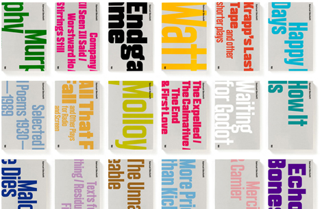
(Click here and scroll to see them bigger at the site of their designer, A2/SW/HK.) These futuristic blocks don’t seem to bear out that modern chestnut at all. Am I right or am I right?
Tags: book design, samuel beckett
I like the Grove cover for the Trilogy- the purple and the noirish photo. These feel too self-consciously “minimalist” to me–and is it weird that I think the vertical text registers as like “twee” or something.
I like the Grove cover for the Trilogy- the purple and the noirish photo. These feel too self-consciously “minimalist” to me–and is it weird that I think the vertical text registers as like “twee” or something.
I’m a minimalist design junkie, a font nerd and a Beckett fan, too. So naturally I loved them and immediately started drooling at the prospect of having the whole set. I love the idea of the cover being the title writ (very) large.
I’m a minimalist design junkie, a font nerd and a Beckett fan, too. So naturally I loved them and immediately started drooling at the prospect of having the whole set. I love the idea of the cover being the title writ (very) large.
Like maybe if I was reading them on an ipod touch those covers would work.
This is a text-based cover I can get behind. My copy doesn’t name the designer, but Roy Kuhlmnan did most (all?) of Grove’s covers during the 60s, and also did The Evergreen Review.
Grove Centeniary editions were gorgeous.
Like maybe if I was reading them on an ipod touch those covers would work.
This is a text-based cover I can get behind. My copy doesn’t name the designer, but Roy Kuhlmnan did most (all?) of Grove’s covers during the 60s, and also did The Evergreen Review.
Grove Centeniary editions were gorgeous.
at first i agreed with you but the longer i stare the more i think i like them
at first i agreed with you but the longer i stare the more i think i like them
I like the way they look but when the design sinks in and I finally read the title I think, wait, what, The Unnameable? Who wrote that?
I like the way they look but when the design sinks in and I finally read the title I think, wait, what, The Unnameable? Who wrote that?
Whoa, that’s pervy.
Whoa, that’s pervy.
yeah, it’s a weird fit. those jpegs are kinda tiny and out of contex on a browser it seems though. i wonder what they’d look like actually in hand. still, weird.
yeah, it’s a weird fit. those jpegs are kinda tiny and out of contex on a browser it seems though. i wonder what they’d look like actually in hand. still, weird.
I like the kind of dirty, crass line drawings on the oldschool penguins. These are too clean.
I like the kind of dirty, crass line drawings on the oldschool penguins. These are too clean.
I like the idea, and individually, I like the way most of them look. I sort of wish they’d remained constant with the fonts and with the wraparounds, though. If you’re gonna go this minimal on the cover, why not keep the variation minimal, too? I guess size-wise, you’d have to change a bit because of lengths of titles, but… different colors, different choices for bleeding the text or not, bold/not bold… the best one (to me) is Endgame. That looks exactly like what I’d think a Beckett text would look like. Black, a little hard to read, bare. I already like the play; I may have to order that one, just because of how much the cover matches my idea of the text.
I like the idea, and individually, I like the way most of them look. I sort of wish they’d remained constant with the fonts and with the wraparounds, though. If you’re gonna go this minimal on the cover, why not keep the variation minimal, too? I guess size-wise, you’d have to change a bit because of lengths of titles, but… different colors, different choices for bleeding the text or not, bold/not bold… the best one (to me) is Endgame. That looks exactly like what I’d think a Beckett text would look like. Black, a little hard to read, bare. I already like the play; I may have to order that one, just because of how much the cover matches my idea of the text.
I prefer the John Calder editions.
I prefer the John Calder editions.