June 23rd, 2011 / 10:20 am
Haut or not
Impossible Mike
Haut or not
I Will Judge Your Book By Its Cover
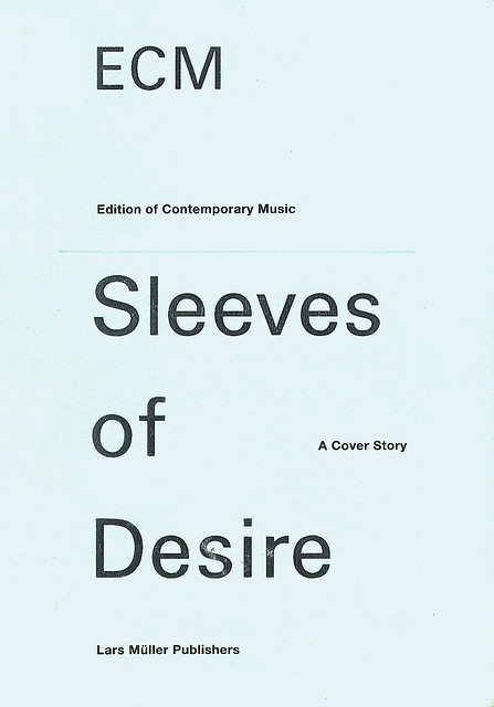
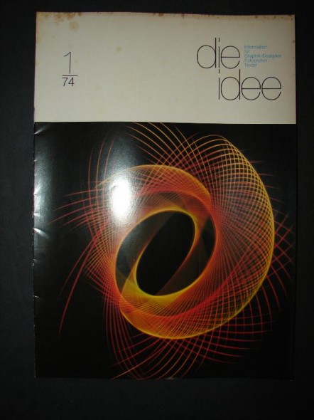
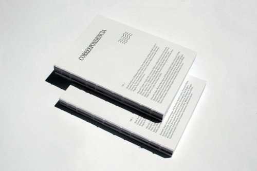
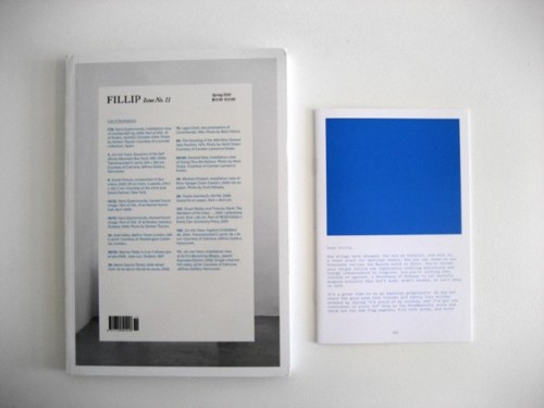
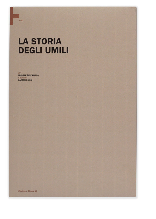
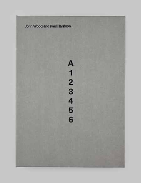
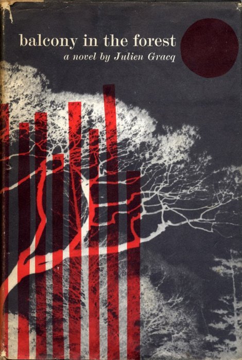
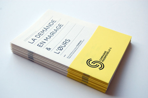
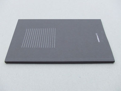
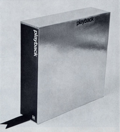
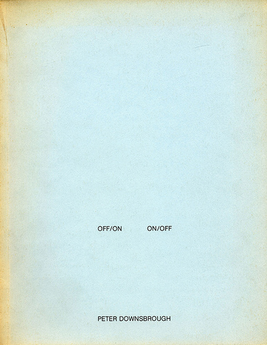
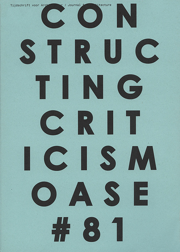
Do you know what I’m tired of? Really bad cover art. I understand that when you run a small press you have limited funds and can’t pay some brilliant designer, but IDK, if you can’t create something new at least copy something good. I’m an aesthete and have no problem admitting that if a book has an awesome cover & i’ve never heard of it, I will be more likely to pick it up. Hell, if a book has an awesome cover and is some weird mathematical exploration of space I will pick it up and read it even though I formerly had no interest in mathematical explorations of space, etc. Here are 35 book/magazine/pamphlet covers that (I think) are better than most things in the world:


i dislike the vast majority of contemporary book covers i see, especially from the major houses
Those are some great covers, man. I’ll agree with you, and even go so far to admit that I’ve actually declined some books for the Vouched table because I didn’t think the design and/or construction was good enough.
great post. are these books you own personally?
especially love the skeletons riding skeleton horses, the horizontal red line, performance of canadian commercial nuclear units and heavy water plants, and the last one.
that notable american women cover just tore my face off.
Damn, you just dropped some science (books) on us.
Off/On On/Off is really pretty. It seems with book covers the simpler a design is, the less it tries to do, the better it will be.
I think the last one is pretty, it relaxes my eyes and makes me think large.
Just for kicks I attached an image of both the handpressed and professionally printed copies of my book. I was slightly inebriated when I did the latter’s cover & dimension.
Now it’s kind of growing on me, I don’t know.
THIS IS A COMPLETELY VALID REACTION
THIS IS A COMPLETELY VALID REACTION
THIS IS A COMPLETELY VALID REACTION
Naw, they’re just images I’ve grabbed from the internet. I’ve read/browsed a couple of ’em tho.
I know, isn’t it fantastic? It’s from the designer who made the actual final one, but the one posted above is just SO MUCH BETTER.
I’m also a sucker for groovy covers – here, I especially like the Corporate Diversity and Zurich Sommer 1980 covers – , as well as cool titles (Ashes and Broken Brickwork of a Logical Theory), author pictures, attractive type, helpful apparatuses (ToC, indices, glossary, and so on), and even cunningly seductive blurbage.
– but, one having gotten into the text – the thing of the thing – , does gratification by one kind of (commercialized) surface not intensify any disappointment with others of its surfaces?
!!!!
Show some you don’t like!
Show some you don’t like!
I’ve purchased books that I couldn’t start reading until I painted out the cover.
I’ve noticed that many (most?) of the small presses that advertise their books
up top on this site have awful cover designs, in my opinion. Just
horrible. I don’t even think it’s lack of funds either. What’s the
equivalent of someone being tone deaf, but visually speaking? That’s the
problem. This country is filled with unemployed graphic designers,
certainly there’s someone with a bit of talent willing to work for
cheap.
Ha. Thanks for the affirmation. I was actually just talking to a pal about this just this morning. It comes down to needing every book on the table to draw eyes to what I am doing–especially since I set up often times at art events. If your book looks like hell, people aren’t going to be drawn to touch it, open it. I need books that people want to open without me intentionally having to point people to it, without me having to disclaim its design and contruction just to get people to give it a chance.
i do like the final cover still, but yeah this – this is something else. i took notable american women to a tropical place and read it on a beach. it was the wrong way to read it. that book got in my chest. ben marcus is a vacation ruiner. in the best way.
These books are absolutely gorgeous. I think VOIDS and balcony in the forest are my favorites.
I like a lot of Caketrain’s covers. I think that small presses have both some of the best and worst cover designs. The creative freedom that comes with running a small press leaves as much room for greatness as it does for really dropping the ball.
On a slight tangent, if anyone knows what the font is that blackie books uses on their covers, please let me know: http://www.blackiebooks.org
I was thinking Caslon Black, but it doesn’t look quite right.
I just tried to tineye the riders cover (skulls and horses) because I’ve seen it reposted on flyers for years. It’s an image that sticks w/ you the way good writing does.
no accounting for taste
Aesthetics are sort of like grammar.
I work at a bookstore and have long thought that the truism Don’t Judge a Book by its Cover seems to work well for almost everything in the world besides books.
I’ve also found a sort of corollary with freebie copies of stories online . . . when I want to read the story I want to read it, but weird formatting is like not getting the HD download of a great movie. Yes, it’s the same, but no, it’s not.
mike u have awesome design taste. i also like ur tumblr. are u familiar with the design website http://aisleone.net?
These books have great design, but I wouldn’t say the same thing about the art. Perhaps most people don’t distinguish art and design like I do.
great!!
Mike, do you know the bookstore/ distributor Motto?
http://www.mottodistribution.com/site/
there’s some serious eye candy there.
also Sternberg press here in Berlin is pretty cool and their new Schlingensief book looks amazing.
thanks for sharing!
sam pink has the best book covers.
people should copy him.
Believe it’s by Paul Sahre if anyone’s curious to see more of his work.
Never sleep with anyone who doesn’t judge books by their covers.
Couple recent-ish favorites:
tasty treats kitchell.