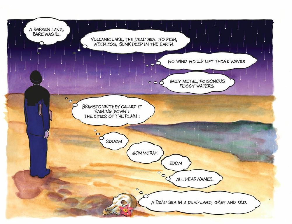
Art/Adaption of Joyce’s Ulysses by Robert Berry w/ Josh Levitas — Here Bloom’s musin’ serious on the beach
*****
[ The Graphic Canon (3), Seven Stories Press, Edited by Russ Kick ]
*****
Publishers Weekly says The Graphic Canon 3 is “the most beautiful book of the year.” And I can’t disagree.* The Graphic Canon 3 (Series 1 is from Gilgamesh thru the 1700’s and Series 2 is the 19th century) is a big, colorful and wonderful 576 page collection of graphic versions and adaptations of important (canonical?) 20th century literature accompanied by helpful notes in which the series editor (Russ Kick) tells a bit about the author and his/her work as well as some background info on how the particular artist adapted it.
(* – There might be other great and beautiful ART and Photography coffee-table “books;” popular “books” of awe-inspiring horse photos, or incredibly cute puppies or kittens; but this is ART about and often consisting, for the most part, in great literature. Some of the ART is breathtaking. And also breathtaking, sometimes, is the ways in which the ART engages and interprets the source text.)
So, ok, yeah, it’s a beautiful book that I think also will provoke much thought and discussion– and in this write-up I’m going to sketch out 4 ways in which I personally engaged with it.
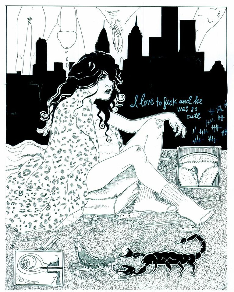
Emelie Östergren’s riff off William S. Burrough’s “Naked Lunch”
*****
However, first I want to bring up a few possible negatives:
1) There is a lot of adult content. Quite a bit is quite “graphic.” And the editor I think is making a bit of a meal in foregrounding (in the intro, etc) the “shocking” aspect of the work (sex, violence, nudity, etc). But, that being said, I kind of agree with what he has to say and, really, the shocking material doesn’t predominate, none of it’s gratuitous, and in its best instances it’s really quite powerful.
2) Sometimes the editor’s notes seem a little loose, a little too cavalier and informal. And sometimes they do make the overall product feel a bit too self-confident, a bit too self-promoting (the sort of cheerleading or carnival salesman voice that spikes from time to time reminded me of how I could talk and posture myself when I sold Beanie Babies, Pokemon, Yu-Gi-Oh and Barry Bonds and Nolan Ryan rookie cards). But, then, again, I found the excitable and energetic editorial voice here quite refreshing in contract to the morphine-drip commentaries and introductions that you’ll usually find in real literature. So, really I’m just nit-picking here because at the end of the day when the product’s substantial and shiny I’ll take exuberant and “kicky” over boring any day.
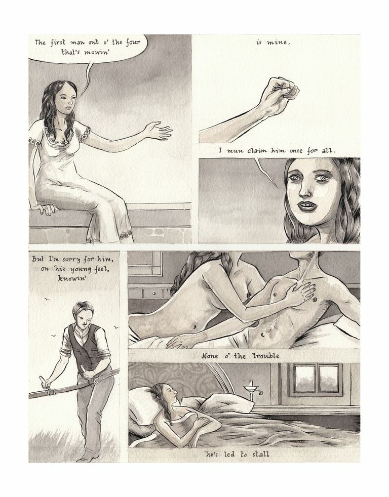
Bishakh Som’s graphic take of D.H. Lawrence’s “The Mowers”
*****
I think the good and attractive side of the editor’s tone could be summed up by the quote from a D.H. Lawrence letter that precedes Bishakh’s haunting and compelling interpretation of the Lawrence poem “The Mowers”:
“My great religion is a belief in the blood, the flesh, as being wiser than the intellect. We can go wrong in our minds. But what our blood feels and believes and says, is always true. The intellect is only a bit and a bridle. What do I care about knowledge? All I want is to answer to my blood, direct, without fribbling intervention of mind, or moral, or what-not.”
Also, I like the refreshing honesty with which the editor introduces Anthony Ventura’s take on Eliot’s Prufrocke: “it can be hard to say precisely what’s going on here.”
Drawing inspired by J.G. Ballard’s Onsmith
*****
3) Even though you’re getting all sorts of bang (the book is 576 big pages, and much of it in lovely color) the book’s $44.95 cover price does concern me. Especially when I’m writing about it here on HTMLGIANT. But, that being said, when I looked on Amazon.com I found several listings at around $25. And for a new book of this size with this much content, color, blah, blah, that doesn’t seem like such a bad deal.
(Also, on the inside cover of the book there’s a note from the publisher that “College professors may order examination copies of Seven Stories Press titles for a free six-month trial period. To order, visit (their site, here) or fax on school letterhead to 212-226-1411)
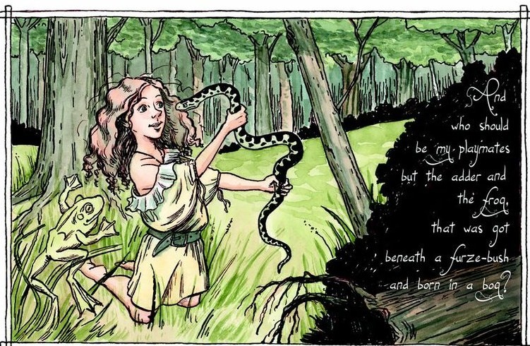
from “The Singing-Woman From the Wood’s Edge” by Edna St. Vincent Millay (pictures by Joy Kolitsky)
*****
The rest of this write-up is divided into four sections: Nostalgia, Regret (?), Desire and Humor.
Nostalgia:
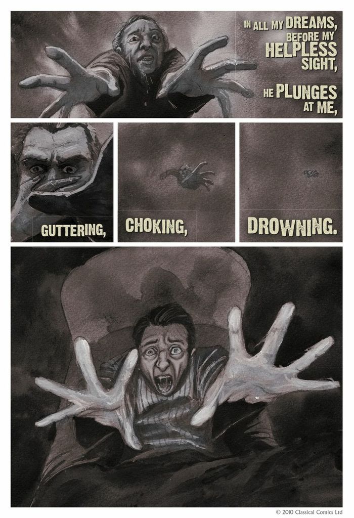
And by “Nostalgia” I mean graphic work that makes me nostalgic for the author and work it’s covering. For example, I started writing poetry in high school and people familiar with my work won’t be surprised to hear that one of the first poems that really made an impact on me was Wilfred Owen’s “Dulce et Decorum Est.” It’s been a long time, though, since I’ve thought of or read that poem.

So, it was a great, strange pleasure and surprise for me when I got to Dulce et Decorum Est in the Graphic Canon and the combination of text and imagery in the comic-strip-like adaptation by Jason Cobley, John Blake, Michael Reid and Greg Powell drove, forcefully, back into me again all that hard dark heaviness which had so enchanted and devastated a younger me so many years back. I was going to just quote the last few lines of this poem that used to simultaneously lift and trample my heart, but, wtf, I’m going to quote the whole damned glorious thing:
Dulce Et Decorum Est
Bent double, like old beggars under sacks,
Knock-kneed, coughing like hags, we cursed through sludge,
Till on the haunting flares we turned our backs
And towards our distant rest began to trudge.
Men marched asleep. Many had lost their boots
But limped on, blood-shod. All went lame; all blind;
Drunk with fatigue; deaf even to the hoots
Of disappointed shells that dropped behind.
GAS! Gas! Quick, boys!– An ecstasy of fumbling,
Fitting the clumsy helmets just in time;
But someone still was yelling out and stumbling
And floundering like a man in fire or lime.–
Dim, through the misty panes and thick green light
As under a green sea, I saw him drowning.
In all my dreams, before my helpless sight,
He plunges at me, guttering, choking, drowning.
If in some smothering dreams you too could pace
Behind the wagon that we flung him in,
And watch the white eyes writhing in his face,
His hanging face, like a devil’s sick of sin;
If you could hear, at every jolt, the blood
Come gargling from the froth-corrupted lungs,
Obscene as cancer, bitter as the cud
Of vile, incurable sores on innocent tongues,–
My friend, you would not tell with such high zest
To children ardent for some desperate glory,
The old Lie: Dulce et decorum est
Pro patria mori.
*****
I had a similar reaction when I discovered the Graphic Canon’s version of Langston Hughes’ classic “The Negro Speaks of Rivers” (my soul has grown deep like the rivers — goosebumps, seriously).
A slight different spin on Nostalgia was my experience of Anthony Ventura’s take on “The Love Song of J. Alfred Prufrock” which, as you can see, is the text of the poem with tall, decadent, long-fingered and aging kind of Aeon Flux characters. I’d never quite had these sorts of figures in mind as I imagined the timid speaker worried about his hair and trousers but I kind of enjoyed, in this case at least, being jolted and shaken up by a version that’s kind of legit as well as disturbingly different to the fossil in my brain.

Prufrocke — art/adaptation by Anthony Ventura
*****
Other pieces that sparked my nostalgia and which will probably have me turning back to the referenced and riffed-off-of literature include the excellent untexted piece on 1984, the emotionally delicate and well-drawn “Araby” (Joyce’s Dubliners), and the explosive moment captured via Plath’s “The Bell Jar”
Regret (?):
This section has to do with pieces of literature that I looked at, read some, and for some reason abandoned. And, so, when I saw the graphic reminders of these abandoned pieces and neglected authors (neglected and abandoned by me, anyways) did the Art make me want to go back to the original work? In some cases, yes.
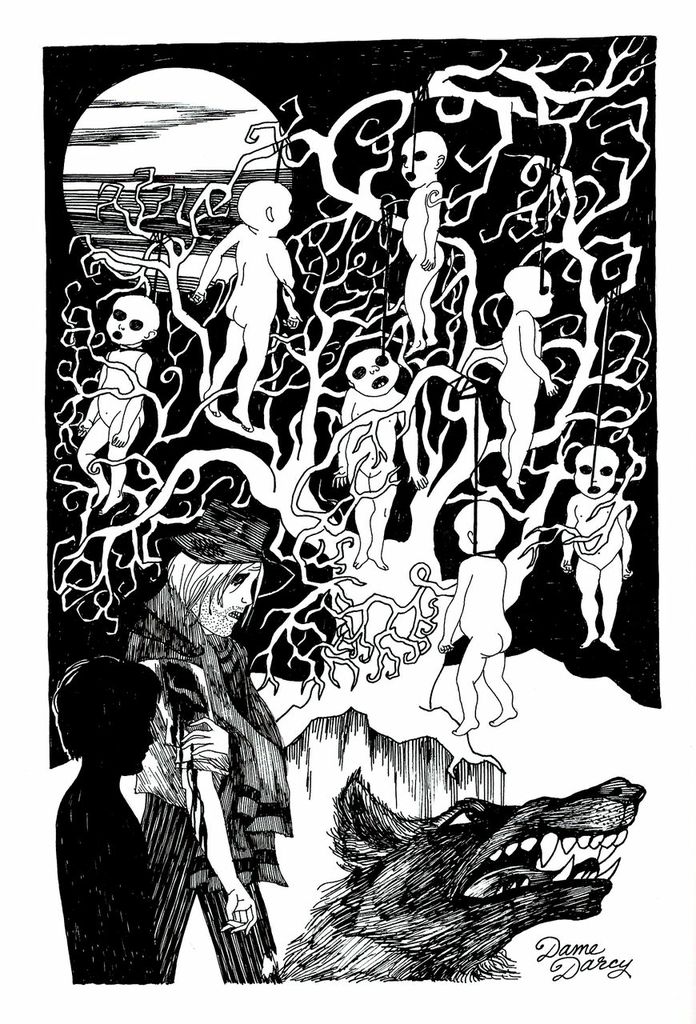
Cormac McCarthy’s “Blood Meridian” — (Dame Darcy)
*****
I made the mistake of starting my Cormac McCarthy reading experience with “The Road” and was overwhelmed by what I took as a put-on, overblown voice. The archaisms and strange constructions clanged awfully in me. Later, I went back and tried “Blood Meridien” but my grudge-mind was so hardened and spiked by “The Road” that I couldn’t ignore the taste of less-clunky (but still-clunky) language. So, I just had to ditch it fairly early on. That being said, The Graphic Canon’s graphic Blood Meridien reminded me of what I liked most about McCarthy: haunting, horror imagery. But, I don’t think I’ll go back to the dark, tedious well of tone and language because I can get that same sort of imagery elsewhere without the exhausting and annoying baggage.
Emelie Östergren’s “Naked Lunch” (2)
*****
And I can’t explain why I ditched “Naked Lunch” since I was really loving it. It’s crazy, visionary, and the language, the cadences, are simply delicious. Maybe it’s my newly-developing theory of diminishing returns. And by this I mean my idea that for some writers you only really need to read a relatively small number of pages at a time (50?). For me this applies to Rumi, Guyotat, Joyce (Finnegan’s Wake), Catch-22, etc, etc. After 50 pages, let’s say, you might just be getting too much of a good thing, and you might just be better served moving on. For now, at least. So, read 50 pages and then in a year come back and read another 50 (or the same 50 over again). This all being said I should return to Naked Lunch.
(it’s worth mentioning here that the editor’s note to Emelie Ostergren’s excellent “riff” on Naked Lunch outlines how much liberty the artist took: “(she) explains that her piece is essentially a riff on the book, using some of its grotesque imagery, rather than an adaptation of any one portion. She believes Burroughs wrote Naked Lunch as a way to deal with his accidental killing of Joan- that in some way the entire book is filtered through her.”)
Other examples of Regret(?) include Joyce’s “Ulysses” (not going back any time soon), Conrad’s “Heart of Darkness” (don’t think so) and the poetry of Edna St. Vincent Millay (yes, for sure).
Kathy Acker – “Blood and Guts in High School” – Molly Kiely
*****
Desire:
This category contains work I hadn’t or had only vaguely known of previously but am now spurred to look into and possibly acquire and read.
To start with, the excellent “The Mowers” piece (which I already talked about above) and the D.H. Lawrence letter excerpt though has me kind of itching to go at Lawrence’s poetry which I’ve never read. (in fact, all I’ve read of Lawrence is “Sons and Lovers” back in high school).
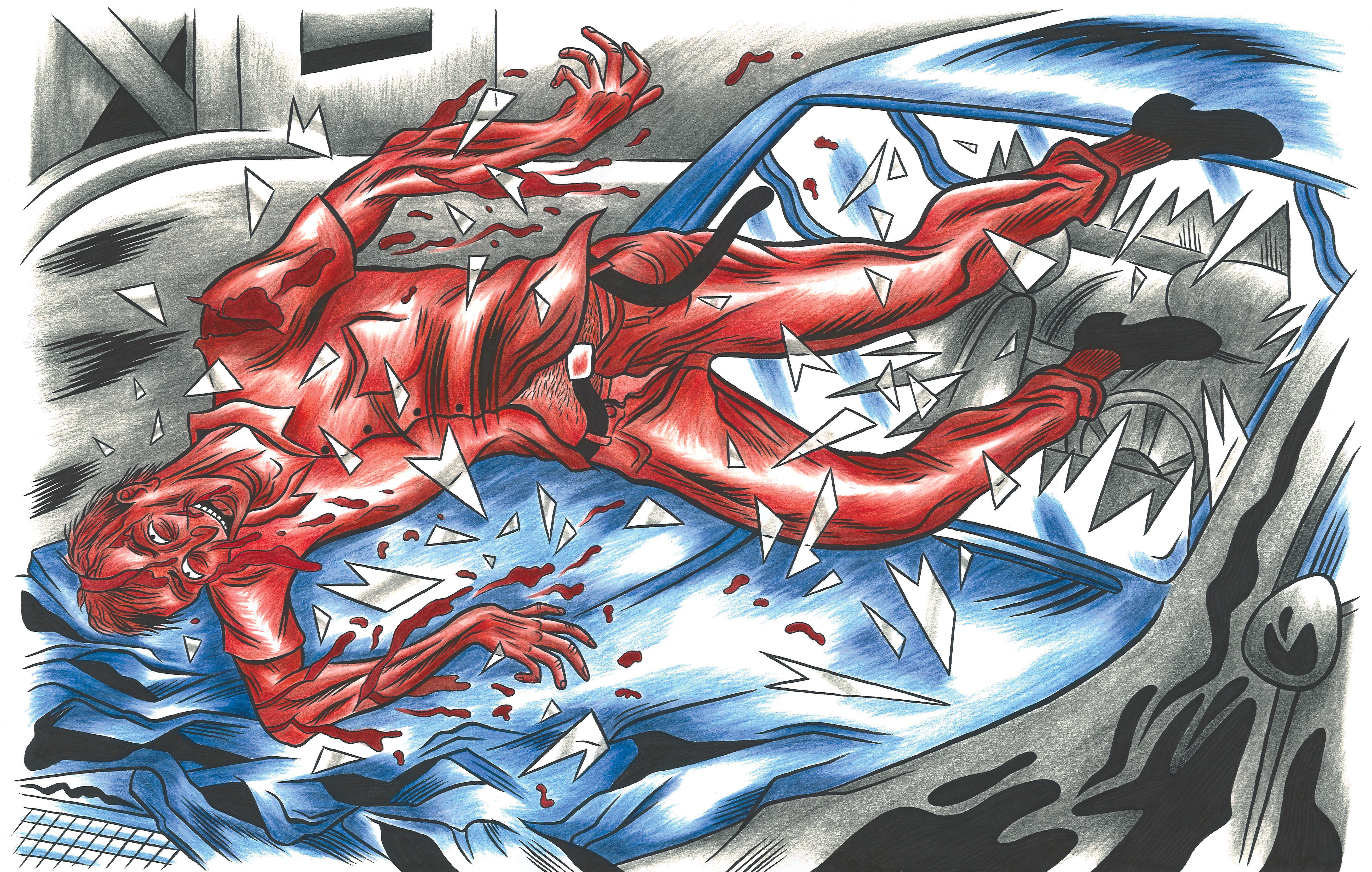
And the wonderful artistic interpretations of Kathy Acker’s “Blood and Guts in High School” (by Molly Kiely) certainly got my attention, of course, as did the colorful and stylized “drawings inspired by Ballard’s Crash” (by Onsmith). The editor’s note on “Crash” deepend my interest:
“Crash is more an experiment with theme. It examines the hidden significance of car crashes, that very literal, painful interlacing of our bodies with technology. Much of the significance is erotic.”
Matt Wiegel’s adaptation of Kahlil Gibran’s “The Madman” and Sonia Leong’s interpretation of Saki’s “Reginald” are just a couple more examples of work that created an interest in me for the original.

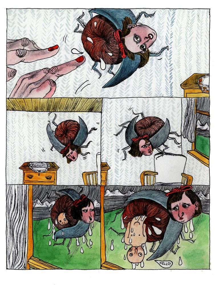
serious but humorous interpretation of Kafka’s classic (R. Sikoryak)
*****
Humor:
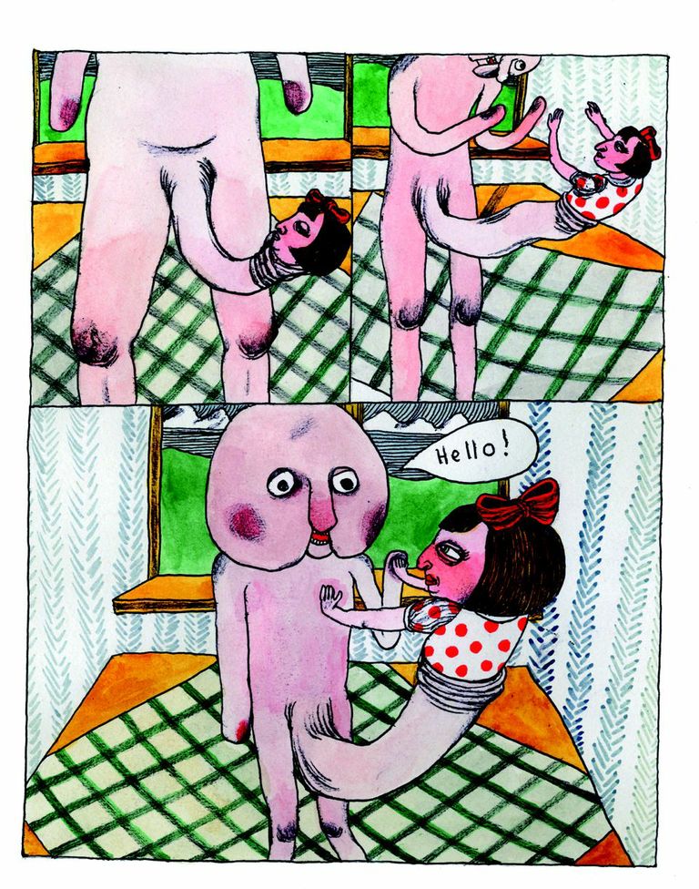
The Graphic Canon isn’t just beautiful, thought-provoking and sometimes shocking with its nudity and violence– it is also sometimes really funny. The first thing that comes to mind (and as seen above) is the mash-up for Charles Schulz’s “Peanuts” and Kafka’s “The Metamorphoses” which is really clever. And funny.
Other good examples are the ingenious and hilarious “Three Panel Reviews” by Lisa Brown (wish there were more of these!).
Conclusion:
Not everyone’s going to love every piece of graphic art in this book. Not everyone’s going to agree with the “canon” it presents. Some people may be appalled at the way some of the artist’s have adapted the original literature. But, it’s a fine looking book that, given the chance, will lead to increased interest in and sales of the literature featured in it. It will also create great conversation.
*****
[ The Graphic Canon (3), Seven Stories Press, Edited by Russ Kick ]
*****
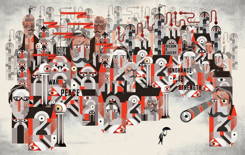
George Orwell – 1984 – Lesley Barnes
*****
Tags: russ kick, seven stories press, the graphic canon
in an email from a friend of mine who’s in publishing:
“I think $44.95 is a bargain for a book that size in 4-color. Do you know how much printing costs these days not to mention time and labor in creating a behemoth like this? ah, but (i’m) constantly defending the value of books against the always rising cost of just getting the thing made and drowning in all the work I have to do myself to keep the retail price down.”
A shitty warning: I’ve got all three, and 2/3 have had their matte lamination peel off. That’s that bad thing about cheap manufacturing (that gets passed on to the consumer)… Regardless, the books still are huge & full. Thanks for this overview, RK; gives me a sorta guide when I pay them close attention.
Also: right on on the diminishing returns theory. I had the same reaction to NAKED LUNCH. Maybe it’s 5-10 pages at a time with that one…
you should send me a “dear rauan” letter!
tinyurl.com/l3cselt
My mom bought me a copy of Poetry Comics by David Morice (http://amzn.com/0671459724) from a yard sale last year. This review reminded me of that book. Has anyone else seen or heard of it?
It’s very interesting with regards to how Morice adapts many of the poems literally. I.E., Wordsworth’s “I Wandered Lonely as a Cloud” features a cloud with legs and Stephen Crane’s “In the Desert” features a fuzzy critter chewing on a cartoonish heart.
I haven’t gotten my hands on any of the Graphic Canon yet (They ARE too expensive if you ask me), but the same questions hovers around both of these books for me: who is the intended audience? Are these books for the nonliterary crowd in an attempt to win them over, or are they an inside joke for the academic? Either way I wonder if this medium falls short.
Morice’s book has the tagline saying “The book you wish you had in English 101” and The Graphic Canon publisher seems to be pushing for adoption in English 101 classes, too. But as an English 101 instructor I am torn. On one hand, the source text needs to be stressed for new readers, but on the other educators like myself are desperate to make freshmen and sophomores give a shit at all about literature. But are comics the answer?
When I was in high school I refused to read lit, but was devouring Watchmen and Vertigo comics, but I think if my Freshman lit prof. in college had handed me either of these books I would have found them pandering.
I fear that I am conflating this issue, but it is one without a clear cut answer for me. Any other thoughts out there?
hi Quincy.. thanks for weighing in, and yr question’s the right one.. will a book like The Graphic Canon make people care more about literature?.. I’m not sure. Like I said in the article my looking through the Canon (and reading in the case of the more comic-strip type parts of it) did pique my interest in Lit I’m unfamiliar with..
but, will the book really create good new interest in lit? or is this sort of thing an unhelpful surrogate?
would be interesting to see what/if feedback we get down the line from teachers who do choose to teach this kind of book,…
Rauan,
I agree about the piqued interest thing. We already LIKE lit, but what about the apathetic young reader?
There’s also a few English composition graphic novels. That’s right, English comp textbooks written in comic-book form. But I’m too nervous to try any of these in my ENGL 101 classroom.
I noticed that Christopher Higgs has taught some comix in some of his lit classes before. I wonder how they worked for him.
e-mail Chris! (I bet he’ll let you know) (wish we could somehow tag him in this thread, a la Facebook!)
Hi, Quincy. Thanks for emailing me.
It’s true, I’ve used graphic novels in literature classes before. I’ve got
notes/plans for an entire comic book course, but I haven’t done it yet.
One semester I taught a course on contemporary monsters and I used Scott
Synder’s Severed. In another course,
an introduction to the European Avant-Garde, I assigned Max Ernst’s Une Semaine De Bonte: A Surrealistic Novel
in Collage. In both cases, students responded positively.
The thing both of those had in common, which differs from
this anthology you’re discussing, is that they’re both primary texts. The Graphic Canon, however, from what I
can gather from your post, is basically a collection of preexisting works of
literature translated into illustrations, which doesn’t really appeal to me as
a pedagogical tool. While it could perhaps work well in a composition
classroom, if, say, you were discussing the different rhetorical effects of
multi-modal productions, I wouldn’t care to use it in a literature classroom or
a creative writing classroom because what happens is that the visual
translation supplants the textual experience: all of a sudden one artist’s
interpretation of a work of literature becomes a stand-in for the work of
literature itself. Don’t get me wrong, the images you have up there of Emelie
Östergren’s Naked Lunch are especially
amazing. Really terrific. But. BUT. They are interpretations of Burroughs’s
work. I am of the opinion that primary sources are important. When I teach Naked Lunch, I want students to read Naked Lunch, rather than some other
artist’s interpretation of it. Similarly, when I teach Derrida, I
want students to read Derrida; I don’t want them to read John Storey’s summary
of Derrida in his Cultural Theory and
Popular Culture book, nor do I want them to read Jim Powell and Van
Howell’s awesome illustrated Derrida For
Beginners – not because I don’t think it’s valuable or awesome (I think it’s
both) but because I think it’s important to have the experience of struggling
with the primary text.
This also brings to mind a time last year when I was
teaching Faulkner’s As I Lay Dying. I
told the class that I wanted them to read the book and THEN read the Cliff
Notes. I emphasized the importance of their first experience being with the
primary text, because that experience cannot be duplicated. But I have no
problem with them supplementing their experience with summary, because for me literature
is not about WHAT is said; it is about THE WAY it is said. Same thing seems to
apply here, I think. It’s not about WHAT Naked
Lunch says; it’s about HOW Burroughs says it. When students’ only
experience of Naked Lunch is this
beautifully illustrated version, they’ve had an experience, no doubt, but not
the experience of Burroughs.
Hopefully that makes a little sense. Sorry if this comes off
as grouchy. I’m sleep deprived and
preoccupied at the moment. But since you emailed, I wanted to offer a response.
Sincerely,
Chris
Thanks for the post, Chris. Great thoughts here.
tinyurl.com/l3cselt
.