Damn, those are pretty. “F. Kafka” is a nice touch.
From the comments: “It looks like the fine people at Pantheon/Schocken are going to make some posters, and maybe some other things as well- we’ll see.”
The eyeballs work pretty well; the Metamorphosis gag is great (could have been the draw to this blogicle) and I especially like the Diaries keyholes. But –
– whoa. Schocken was publishing Kafka in Hebrew in Palestine while his family was being liquidated?
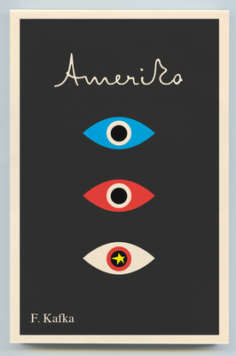
Damn, those are pretty. “F. Kafka” is a nice touch.
From the comments: “It looks like the fine people at Pantheon/Schocken are going to make some posters, and maybe some other things as well- we’ll see.”
Reading that blog is going to ruin me financially.
These are stunning and complement the work beautifully.
I hope Schocken is sticking with the old Muir translations which, for all their imperfections, are still the most readable.
?
I’d like to buy some posters of these covers. Are they for sale?
The eyeballs work pretty well; the Metamorphosis gag is great (could have been the draw to this blogicle) and I especially like the Diaries keyholes. But –
– whoa. Schocken was publishing Kafka in Hebrew in Palestine while his family was being liquidated?
. . .