Behind the Scenes
STARK WEEK EPISODE #2: “Off the Top Rope” — Matt Bollinger on collaboration with Sampson Starkweather
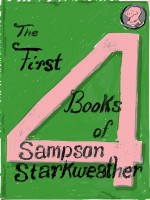
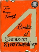
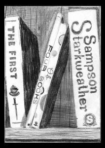
For Episode Two of STARK WEEK, we hear from Matt Bollinger, who designed and drew the front and back covers of The First Four Books of Sampson Starkweather.

 Sampson wrote to me early last December to ask if I would make a cover for his book. “I’m very busy,” I summarily replied but in less summary and more polite terms. Because of a new full-time teaching job and an impending solo exhibition, I felt there was no way I would possibly have the time to make a cover. The next email I received from him came like a sudden summer storm (particularly strange in the final week of a wintering semester) complete with simultaneous heavy raindrops and sunshine. He supplied approximately 43 ideas for the cover, including examples from the history of fantastic poetry covers. Here’s an example:
“A note about Andre the Giant off the top rope: this is actually an image that doesn’t exist, which is why it’s appealing to me, the unknown, what only lives in the imagination…so to my knowledge, Andre the Giant has never jumped from the top rope, but god, how i longed to see that; (i’ll send you the poem about it), but in my imagination, i love the image of the 7’5 almost 600 pound flying through the air Jimmy-Supafly-Snuka-style, althought i’m thinking the image would only be part of him or his silhouette, or partly his enormous shadow….”
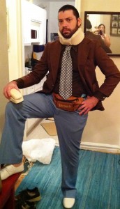 A few days after the semester ended when I was in rural Illinois staying in the log cabin where my fiancé grew up, I found myself making numerous studies for the cover. It seemed that I was going to design the thing after all. Sampson, like his neck-brace wearing alter ego from the sectional cover of Self Help Poems, is impossible to say “no” to. Of course, I realized that I couldn’t possibly have let this chance go by. I felt too much of a kinship with his poetry. In my painting-collages, I grapple with a similar intersection between memories (possibly misremembered) and the present moment; between romantic hopefulness and a self-conscious criticality that withers nostalgia. Sampson puts it well in Self Help Poems:
Nintendo always felt more real than life. Simple yet somehow beautiful worlds, constantly breaking down, designed, whether intended or not, as pixilated avatars of hope. Old school video games are perfect precisely because of how unreal they are. They don’t try to teach you anything, except if you see a hammer, you better grab it.
The process of designing the cover was definitely collaborative. In my recent exhibition at Zürcher Studio in New York, I collaborated with a number of poets, Farrah Field, Alina Gregorian, Steven Karl, and Paige Taggart, who supplied texts for collages I made that depicted notebooks (Dan Magers handled the editing process). This project readied me for the onslaught of fantastic ideas that Sampson and I power-spiked back and forth (not unlike a twisted game of dodge ball where the only defense against the red rubber ball hurtling at face-bash speed is to slam it with your best haymaker).
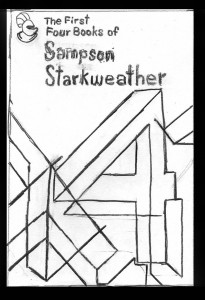
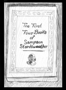
When developing the images for the front and back covers, Sampson and I discussed Andre the Giant, Louis Zukofsky, “guerrilla underground hand-drawn poetry press style”, LARPing, Nintendo and Mickey Rourke among other things. Sampson had become obsessed with both the coat of arms and a large number 4 modeled after the “A” on Zukofsky’s famous cover. While we tried out a number of variations (see below), we went with the big 4 on the front and the coat of arms on the back.
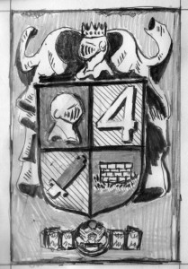
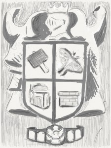 I had the idea that the coat of arms should spawn from the inner selves of the various personas in his books and arrived at the hobo-TV-fire, the well (Sampson’s idea), the butterfly, and the grabbable hammer mentioned above. We hoped that his cover would resemble an older generation of much coveted books, the sort grabbed hungrily and pressed to the chest in basement bookstores or, more likely, found wrapped in a banana leaf on the shore of a distant island, the same far-away shore where you might find yourself 300 years in the future founding a religion who worships that sacred number: 4.
Matt Bollinger is an artist who lives in Peekskill, NY. He has exhibited extensively in the U.S. and France. In March 2013, he had his most recent solo show, Bed on the Floor, at Zürcher Studio in NYC. His work has appeared in the New Yorker and has been written about in Le Monde, Elephant Magazine, Anthem Magazine, and elsewhere. He is represented by Zürcher Studio, New York, NY. www.mattbollinger.com
Tags: Matt Bollinger, stark week
think i’m going to have to spend te rest of this afternoon pouring over matt’s site. thanks for the post and the link.