Cover Fail
The difference between a press you’ve admired for years and a press you’ve never heard of is the former is willing to pay a little money for its covers. There are presses that have been around for decades, that pour their sweat and tears into publishing more words than any of us realize, and that absolutely no one but a tenure committee cares about because they can’t be bothered to pay for a decent cover. I’m not above designing without the proper training myself, but I at least pay for raw art to use on my magazine’s covers — and I do try to actually design. I didn’t want to call anybody in particular out, and it’s insanely easy to replicate the bad covers that drive me up the wall, so I made a few shit covers of my own. If your press’s output looks anything like this, for the love of God, stop what you’re doing and find a freelancer to do something better.
Now let’s talk about what happened here:
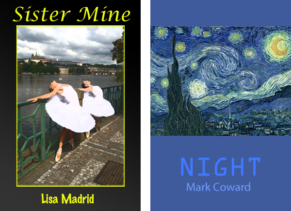
Sister Mine: What happened here is you had a photograph that you thought would look nice on a cover. You didn’t think it quite looked deliberate or stylish enough for a cover, though, so you tried two photoshop filters and the second one stuck. But — in what will become a recurring theme in your life — you discovered that the photo wasn’t quite big enough to fill the cover. So you did what any editor in chief of an over-funded, under-read university press would do, what they’ve all done throughout the ages: you gave the photo a border, put a “tasteful” gradient behind it, and framed it with text. Speaking of which, nothing says “literary fiction” like two mismatched fonts that vaguely suggest handwriting.
Night: Starry Night is public domain, right? It’s gotta be. The theme for the rest of the cover is “adjacent shades of blue on a color wheel.” Is the text centered? More or less. The title font suggests a science fiction poem. The font used for the author’s name tells us that the author has a name.
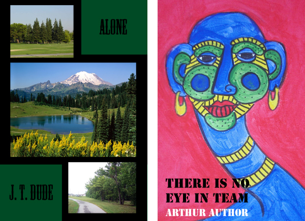
Alone: What happened here is a google image search for “nature.” If you put these pictures next to each other like this it becomes a collage, which makes it legal. The black and green scheme communicates seriousness and reinforces the theme of “nature.”
There Is No Eye in Team: Writers get really excited when they meet someone who practices any other kind of art. It’s almost as good as having a close black friend. If you are a painter who knows a writer, take comfort: at least one person in this world thinks you’re a genius. You can’t get any gallery shows, no one ever comments on your DeviantArt page, and your musician friends probably know better than to let you anywhere near their records, but if you don’t mind working for free then you can be a cover artist! Just let them flip through your sketchbook for a little while at the cafe where your paintings have been displayed for two hundred dollars or fair trade for the past eighteen months. They’re sure to find something inside that’s just perfect. The black and white text evokes the novel’s theme of racial tension, and the stencil font suggests that while race is a construction, our nation’s race relations are under construction.
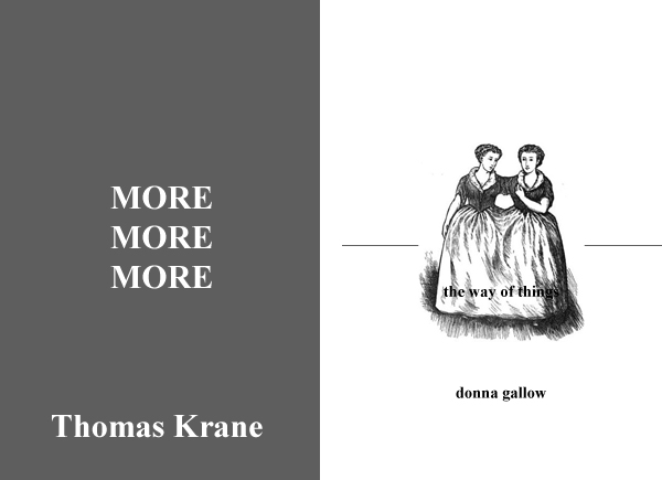
More More More: Your press respects language too much to sully your covers with things like “representative images” or “fonts other than Times New Roman.”
The Way of Things: Nothing says literary resignation like lower-case text! The black and white cover will be cheap to print. History is the best source of clipart. The reader struggles to read the title hidden in their skirts just as the reader must struggle to construct a story from the text. The interrupted line at the center of the cover represents your irrational fear of negative space — and the fact that you don’t think it’s possible to “erase white” in Photoshop.
Tags: covers, failure, not jimmy chen, shitty design


Great job on these shitty covers, which are sadly very accurate for the kind of press you’re talking about. There’s one press I’m thinking of that, at least in my mind, is legendary for this kind of “design,” a repository of the never-to-be-read for professors who need that second book to get tenure. They published a collection by one of my profs, and he convinced them to let him design the cover. It still turned out horrible, however–the image was all pixelated and blurry and the inside was printed on cheap Xerox paper and ridden with typos. I can’t imagine anything more depressing.
I’ve been collecting these kind of shitty covers at work to write this exact same piece. now I’m slightly miffed you did it first.
I… I’m sorry, Alex.
Silence? Shouting? Suicide?
The muumuuvians don’t seem more ‘literarily resigned’ than conventional punctuators. Maybe gallow is saving her CAPs for later, like not cumming ’til the fifth billow.
“Writers get really excited when they meet someone who practices any other kind of art. It’s almost as good as having a close black friend.”
This articulates – exactly- why so many readings I’ve been to lately have featured really terrible found footage video accompaniments. Dear writer friends: make this stop. I made better avant garde ‘student films’ in high school and for real, you can’t get away with calling your liberal arts educated quirky friends “outsider” artists…
I love this piece more than I can say. I’m going to print it, make a crappy photocopy, frame the crappy photocopy in gold, take a horrible snapshot of it and make it the cover of a random book. Probably one about starving children somewhere. The typeface for the cover will be ‘Impact’ so that everyone knows this is serious, but with a pink glow so that they also know it’s not that serious. It will be the worst, but also the best.
i’m glad comments are back because i wanted to say how much i loved this. i have to buy a lot of upress poetry books for school and jesus christ some of these covers make me actually angry that a press thought that garbage was a good idea. i’ve even brought it up in class but unsurprisingly my prof was irritated by my question because apparently the covers don’t matter when it comes to poetry, it should just sell itself by people somehow already knowing who you are in this world of 1000000 unknown writers who all have shitty book covers that nobody gives a fuck about when they see them all listed in the AWP magazine that’s too big for its own good in every way
Yeah. There are a lot of presses I won’t submit to out of fear that if they accepted my novel, I’d actually let them publish it with one of those shit-ass covers. Most of the time a bad cover correlates pretty well to a bad press and a bad book, in my experience, but there are very real exceptions and it breaks my heart that they’re saddling such good books with such bad covers.
Do you folks have any links to presses that produce covers like these? I remember seeing some in The Writer’s Chronicle years ago. I guess I might get to see some at AWP!
it’s cool. did you design these or are they ones you found? they’re nearly indistinguishable from the real ones I’m collecting.
I designed them! The secret is to allow yourself no more than like ten minutes per cover and use whatever font you try first.
Several years ago I emailed Ron Padgett to ask if he had any say in this
and his answer was no, he had no say.
Anyway there’s supposed to be a picture of Padgett’s You Never Know in that space
Yeah, I’m going to continue the trend of cheerleading and applause for this post. As hilarious and pointed as any I’ve read on HTML Giant of late. Oh hilariousness. I love that too. That nebulous term and what it nebulously refers to.
As a reader this makes me go “fuck yeah! seriously i hate that shit what the fuck guys”
As a fledgling designer for a fledgling small press this makes me super duper nervous.
there is no eye in team looks like a sam pink illustration or something
sam pinks drawings make me think things like ‘tribal’ and ‘masai ppl’ i don’t know
I think that is a healthy response, honestly! The willingness to second-guess a design decision seems important to making good design decisions. I think keeping it simple is usually a good place to start. Three of these could have been fine or even pretty good without certain ugly additions.