Uncategorized
Fun at the bookstore
I was hanging out at a book store (had 4 hours to kill, girlfriend induced) and started noticing a lot of similarities and relationships between the book covers, so with a little (just a little) manual intervention, captured some moments I’d like to share.

Most of Murakami’s book covers feature some 50s-type Japanese lady, especially her eyes. I’m sure the art directors at Vintage are aware of this — just not so sure if it’s some default passive motif or if there’s a broader concept to this. True, women are an evocative concept in his books, but I don’t think so much to warrant almost every cover.
—

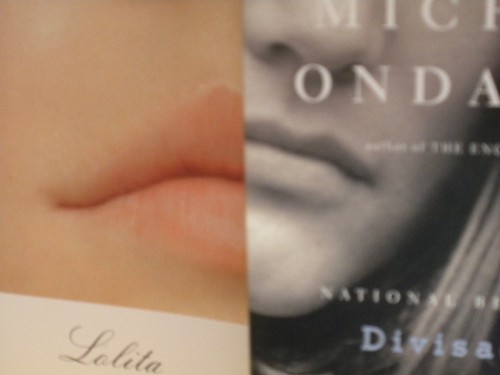
There was a lot of fellatio in Lolita, so I guess those lush lips are not completely arbitrary. Funny how women’s body parts are still used with such liberty. (Hey feminism, what happened?) I’ve never read Ondaatie’s Divisadero, but I frequent the street it’s named for often. Writers really like naming specific streets if those streets are in literary cities, especially New York; it’s like how Snoop Dogg keeps on referring to da’ LBC (Long Beach County) — there’s a sense of territory, like taggin’.
—

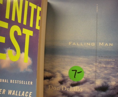
The clouds in the 10th year anniversary edition of Infinite Jest suggest that which is infinite: the sky. (Yeah, not the most inspired idea.) The clouds in Don Delillo’s Falling Man allude to western ascension (via capitalism) — all this before of course September 11 brought us back down to zero. DeLillo is a modern hymn. The $7 dollar sticker floats above like a sad martian planet.
—

I’ve noticed more and more graphic illustrations on covers, which I really like. Penguin revamped a bunch of their classics with new artwork. I don’t like book covers using photos which attempt to convey the content or theme, as it constrains our internal visual vocabulary (i.e. light, tone, etc.) of the novel. So much of reading is visual, and I don’t want no stock photo messing with my biznatch. This is why I prefer line illustrations more; the flatness is impenetrable — leaving open the words inside.
—

Is jPod supposed to be the sequel to Microserfs? Both book covers feature lego-like humans on the same gray. I sound bitter typing this, but Coupland’s art reeks of Jeff Koons, and I don’t think ‘ironically.’ I once heard Coupland speak/read and he said [paraphrase]: “Never start writing before you know the ending.” Is that good advice?
—

Here’s a little sea line made from Tom McCarthy’s Remainder; Eugenides’ Middlesex; and Chris Adrian’s The Children’s Hospital. This sea is either half empty or half full, depending on how much you believe in fiction.
—

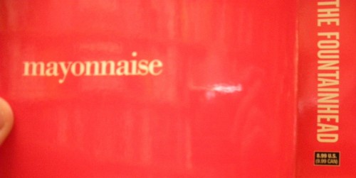
The mayonnaise is the back of Brautigan’s Trout Fishing in America/In Watermelon Sugar (I wonder if Apple got their iMac idea from Brautigan’s iDeath) book, which shares the exact same hue as the spine of Ayn Rand’s The Fountainhead. I ended up buying the former ($9.00 dollars, used) and left the latter to weigh down the shelf with self-important ideas.
—

A lot of people are talking about Pride and Prejudice and Zombies, which I have no comment other than postmortemmodern. When Van Gogh (as seen in David Sedaris’ When You Are Engulfed in Flames) painted a cigarette in the skeleton’s mouth, it probably had nothing to do with postmodernism. He was just “fucking around,” which, I beg to say, is probably what Brautigan, DF Wallace, even Nabokov were doing — because that spirit of invention for the sake of possibility, is at heart was the greatest fiction is about, to describe a world known in a way unknown.
Thank my girlfriend for taking four hours to buy fabric and look for wastebaskets, seriously.
Tags: Book covers

The Jimmy Chens of the world like to put book covers together.
The Jimmy Chens of the world like to put book covers together.
except netherland from joseph o’neill and infinite jest are pretty much the same cover, more so than falling man and ij.
mm, mayonnaise fountain
except netherland from joseph o’neill and infinite jest are pretty much the same cover, more so than falling man and ij.
mm, mayonnaise fountain
funny, i actually had a version with netherland in the photo, but decided not to use it. you are sharp!
funny, i actually had a version with netherland in the photo, but decided not to use it. you are sharp!
nah. i just work at a bookstore and stare at covers all day, 9 hrs a day. but nice post jimmy.
nah. i just work at a bookstore and stare at covers all day, 9 hrs a day. but nice post jimmy.
Yes, feminism has failed us in the book marketing department. Almost all books written by women will have a female body part on it.
Yes, feminism has failed us in the book marketing department. Almost all books written by women will have a female body part on it.
Everyone’s seen the original version of that Lolita cover, right?
http://erickert.blogspot.com/2007/04/tip-of-tongue-taking-trip.html
Everyone’s seen the original version of that Lolita cover, right?
http://erickert.blogspot.com/2007/04/tip-of-tongue-taking-trip.html
Legs and feet mostly.
Legs and feet mostly.
Also, if you manage to do a whole bunch of these and start a blog asking strangers to send their own to you, a publisher will give you six figures to turn it into a book, Jimmy.
Also, if you manage to do a whole bunch of these and start a blog asking strangers to send their own to you, a publisher will give you six figures to turn it into a book, Jimmy.
Wow. That would have been….yeah.
Here’s a whole gallery of Lolita covers from around the world:
http://www.d-e-zimmer.de/Covering%20Lolita/LoCov.html
Wow. That would have been….yeah.
Here’s a whole gallery of Lolita covers from around the world:
http://www.d-e-zimmer.de/Covering%20Lolita/LoCov.html
this blew my head.
this blew my head.
another interesting thing to look at is book titles. what is with the recent spate of “The _______’s Daughter”. do a search on amazon and you’ll be amazed at just how many of these there are.
another interesting thing to look at is book titles. what is with the recent spate of “The _______’s Daughter”. do a search on amazon and you’ll be amazed at just how many of these there are.
good.
good.