ToBS R1: no-taste design aesthetic online magazine vs. facebook updates of what you ate / listened to

[Matchup #13 in Tournament of Bookshit]
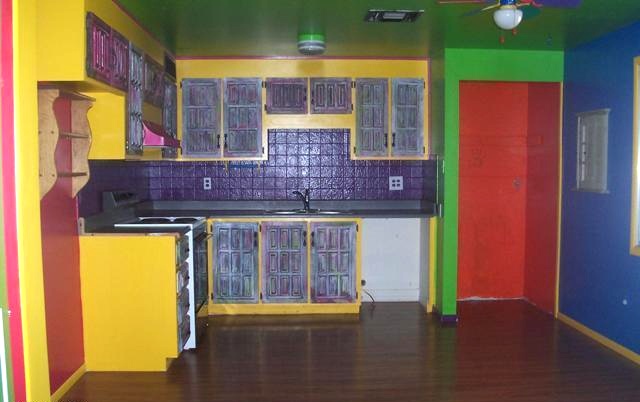
In the Really Fucking Ugly corner, weighing in at less than a tenth of a tenth of a tenth of a pound, is the entire coded structure of happydogmomlitjournal.blogspot.com. Happy Dog Mom Lit Journal is a newcomer on the scene, but has recently secured training with the Google AdSense and AdWords programs, showing off a stiff upper right corner text ad box that flits out ads for Moleskine journals and Tin House magazine subscriptions. Its ability to fly almost completely under the radar––to not have a single pair of eyes look at it, at all, for years, save the eyes of its own mother and master and pen-name bedecked story feeder, among the occasional algorithmic complimentary link bait––is truly amazing. It’s a stunning example of incompetence, laziness, a journey retarded before it’s even begun, and a complete lack of aesthetic sense beyond the named, repuked text-based emotional “landscapes” that can cohere, almost accidentally, under forty thousand clicks or more, here called curation. READ MORE >
