Elaborate Solutions to Problems that Maybe Only I Perceive as Problems, Part 1
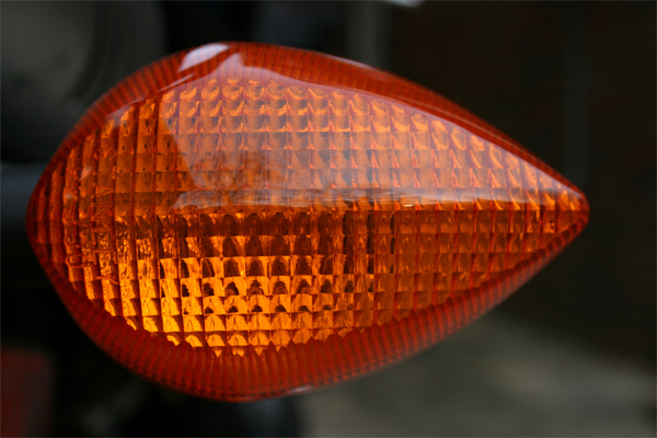
Why don’t all our turn signals blink at the same rate?
That moment when I am waiting to turn left at the intersection and so are two cars in front of mine and three cars behind and all our signals are flaring and dying. I have terrible astigmatism, which smears the light across my vision. This effect is exaggerated by my dirty windshield. My light blinks and your light blinks and this light blinks and my light blinks and this light blinks and your light blinks. 1, 2, 3, 1, 3, 2, 3, 1, 2. What I mean to say is that the order changes. The relationship shifts. Some lights are faster than others. Say yours is faster than mine. So there is a time where we blink in alternating shifts. And then there is a time where we are blinking together. And then we slowly shift apart again, back to the time where we are blinking separately. This makes me feel a little ill.
It’s bad enough they blink at different times. They should at least keep the same rhythm. If we knew, at the intersection, that mine would go and then yours would go and then hers would go and then his and then we would do it all again then I could prepare myself for the sensation. What I can’t live with is what we have now, where everyone is blinking to a similar but very slightly different rhythm, so I never know what’s coming next, or where, only that it’s coming.
But it would be best if all our signals could signal at once. “Left,” they would say. “Left, left, left.” And then these others, at the same time, on the same beats, would say “Right, right, right, right.” The ideal tempo is something for the Congress to determine. What we can do is we can build a little device into every car that receives a signal from say a network of radio antennae. Or possibly this could be piggybacked through cellular towers, GPS satellite signals, or etc. What the signal will say is, “Now, now, now, now,” forever. What the device in our cars will do is it will tell our signals when to flare. “Now, now, now, now,” they will say. When you flick the switch that activates your car’s turn signal there will be a very slight delay as said car, listening to said transmission, waits for the next beat. “…now, now, now, now.” And so the chaos at the intersection will end, and I won’t feel so much like throwing up when I drive. And consider, as an additional benefit, how beautiful this will look from the sky: the USA, as seen from above, will be bright, and then a little brighter, as collectively we signal. Left, right, now, left, right, now, now, now. Bright, and then a little brighter.
Superhero Wikipedia Pages: Hulk Guys Edition
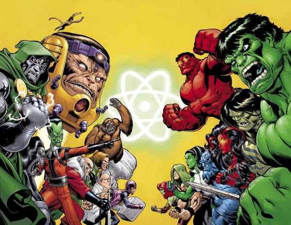
HTMLGiant’s Superhero week has, like a day-glo-green mutagenic ooze, spilled over into an additional week, and may continue for all of the weeks to come, forever. In this post, I construct some (let’s call it) free-verse poetry from more Superhero Wikipedia pages, this time focusing on some of the Hulk characters. My feeling isn’t that the language of these things is beautiful, though it is sometimes what I would call incredible. What I find continually hypnotic is their dedication to story above all. CLICK BEYOND THE FOLD TO LEARN THEIR EPIC STORIES!
Games Taught Me to Care About You
When presented with bad design, I often become irrationally, almost violently angry. The first time I was exposed to the class registration system at NMSU, I was seated at a university computer, in a public place, with my wife. None of these things stopped me from thumping the desk with my fist after twenty minutes of trying and failing to make the goddamn thing do what I wanted. I have said that bad design actually makes me more angry than the Holocaust; this is true. Obviously the Holocaust was worse than bad design, but I have no direct experience of its horrors. Bad design is with us every day, corroding us inside and out. It feels more immediate, to me. It feels oppressive.
Bad design makes me so angry because it is a message from the world, a whisper. It says: “No one cares about you. No one knows that you exist. No one knows what you are like. No one has taken the time to imagine you. No one wants to think about what you need or want. You are profoundly unimportant.”
I Love Superhero Wikipedia Pages
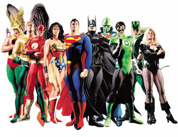
Why? Because they’re awesome. Because they are crash courses in thrilling storytelling. Because they are almost incomprehensible enough to be published by a hip indie lit journal. Because they save me the time and money required to read actual superhero comics, which are mostly garbage anyway (with all due love and respect to their creators: I know you guys are mostly doing your best with a ludicrously difficult format and schedule). Because I have a lot of fondness for characters I enjoyed as a child. Because they are so bad and so beautiful. (I’m also in it for the pouches.)
Superhero Wikipedia pages are insane because hero comics are insane. Understanding the conditions and constraints under which any story is produced will of course help you better appreciate said story, but in the case of hero comics it’s really the only way to understand most of what happens. Here are the key facts: 1) Hero comics are published on a monthly schedule. 2) Hero comics serve two consumer bases: teenage boys, who remember nothing, and nostalgic adults, who remember everything. 3) Hero comics almost always take place on what seems to be a present-day Earth. 4) Though comic book movies have never been bigger business, actual comic book sales seem always to be on the verge of collapse.
Notes on Design: In Praise of Ragged Edges
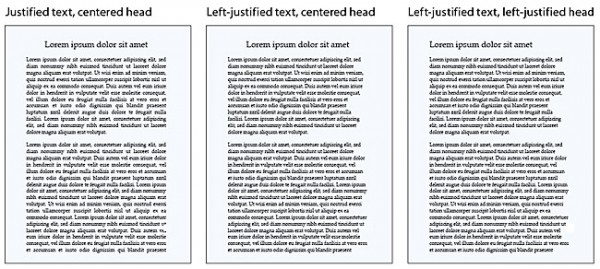
I am a largely self-trained book designer. I hope to someday have the time to take formal courses in design, but for now I do my learning by studying the books I read. This means that often I will come across a convention in book design that I simply do not understand. These conventions are not universal, but they are common. Indie and major presses seem to agree, for instance, that text should be blocky. In fact, the text of this website is mostly blocky.
What I am talking about is justification. At some point, nearly all the book designers in the US got together and decided that the proper alignment for prose was left-justified. What does a left-justified paragraph look like? Well you are reading one now. The left edge of the paragraph is aligned with the left margin, and the right edge of the paragraph is aligned with the right margin. The last line of the paragraph breaks this rule, because it would require extreme distortion of the text to ensure it met the right edge (the last line might be, after all, just one word long, and we don’t want to see that stretched all the way from left to right). But here’s the thing: essentially every line has to be distorted at least a little to make the edges match up right, and once you see this, it can be very hard to un-see it. The spaces between words and individual characters swell and shrink according to the needs of the line. You may find yourself struggling to read an especially crowded line; you may find yourself wondering why the spaces between the letters in the word “between” are so big. Words that disrupt the shape of the text too much become hyphenated in order to stop them from causing trouble. Sometimes they even split across two facing pages. Sometimes this is not disruptive. But sometimes it gets very ugly. READ MORE >
I’ve missed you.
1. There have been a hundred things that I’ve wanted to tell you in the time since I last wrote here. 2. I have a new job. 3. I was sick for a week. 4. I was busy playing text adventures with strangers and friends. 5. I was reading. 6. Here is a list of what I’ve read since AWP, mostly over lunch: Amazing Adult Fantasy by A D Jameson, Motorman by David Ohle, Theater State by Jack Boettcher, RASL 3 by Jeff Smith, Adventure Time issues 1 & 2 by Ryan North and pals, Unclean Jobs for Women and Girls by Alissa Nutting, The Next Right Thing by Dan Barden, My Only Wife by Jac Jemc, some of Matt Bell’s Cataclysm Baby, some of Humboldt’s Gift. 7. If you would like to say something about one of these books then I would like to hear it. I have enjoyed them all a lot. (Well, I had my issues with RASL.) (I am trying to withhold judgment on RASL.) 8. I wanted to tell you about Brian Oliu’s Level End, which is stranded at my in-laws’ home because of a Paypal snafu, and which has an actual Gold Edition, supplies limited, with video, audio, glorious NES-style art, etc. 9. My friend Carrie Murphy has a book coming too. It is made of fun, pretty, sticky, weird, nervy, sexy poems; some of them I have known and loved for a long time. 10. My wife and I saw H. Jon Benjamin and David Cross from a distance at a bar during the Mission Creek festival. (We were selling magazines and toy snakes. We were eating chicken salad and fish sandwiches.) My wife couldn’t stop smiling. We have spent a lot of time listening to H. Jon Benjamin’s voice. 11. When you come to this blog do you sometimes feel stressed out and angry about how much time everyone else is finding to read? Sometimes I feel that way when I come here. 12. And sometimes I am glad. 13. I’ve been playing lots of Dark Souls. We could talk about that too. So far there is nothing in it as strange as the best parts of the first game. Unlike the rest of the world, it seems, I am a little disappointed. 14. There is nothing more humbling in its arbitrariness than truly good news. 15. Soon I will write here about the handful of design mistakes that every press, yours probably included, is making. 16. Sometimes waiting to hear back about a book I am submitting feels like waiting to find out if I am dead or alive.
Exits Are
So I hesitate to use this space to self-promote, but in this case I will make an exception, for a number of reasons, beginning with the fact that the project is online and free.
Exits Are is a series of collaborative stories that are also games. The games borrow their format and many of their conventions from text adventures (“interactive fiction”). From the about page: “A text adventure is a game that takes place in prose. The computer describes a world to you one room at a time, writing in the second person. ‘You stand in the center of a cool, dark cave,’ says the computer. ‘Exits are north, south, east, and west.’ The computer waits for you to tell it what you want to do. ‘Go east,’ you might say. Or if there is a key, you might say ‘take key.’ The computer parses your commands as best it can and tells you what happens next. . . . love text adventures, but they usually disappoint me. I wanted a way to make them more open-ended, less about puzzle-solving and more about language: its weirdness, its beauty. So I started playing a game with some of the writers I knew. Using gchat, I pretend to be a text adventure. The other writer is the player. We use the form of the text adventure to collaborate on some kind of strange, fun narrative. The only rule is that we take turns typing. We never discuss what we’re going to do in advance, so the results are improvisational and surprising/exciting/stressful/upsetting for both participants. Every time, the player does things I never could have seen coming.” READ MORE >
Vidja Games and Mystery
Narrative is rarely any fun without mystery. You can get mystery in a lot of ways. In a creative writing class my senior year at Butler, my teacher Susan Neville passed a story around the room. I don’t remember what the story was. I think it was about two people in a car. I think they were young people. Susan pointed out that though the characters were taking turns speaking, neither one was responding to what the other person had to say. She said that if you listened to the way people really speak to each other, this turned out to be mostly true. We don’t listen: we wait for our turn to speak. What she didn’t point out was that this stood in stark contrast to the way college students tend to write, wherein a pair of extremely attentive conversationalists trade ideas and information in the collaborative pursuit of synthesis, consensus, etc. What she also didn’t point out was the way that this corrodes the mystery of the story: when two characters with ostensibly different interests agree completely on the direction of a conversation (or even on the terms of their own disagreement), the writer’s intent becomes glaringly obvious. So there is one way of creating mystery. Make your characters talk past each other.
Another way is to present an image so breathtaking, so rich with implications, and yet so beyond our grasp, that mystery can’t help but form. Another way is to create a character who makes interesting decisions that make us wonder why they made the decisions. Another way is to make thoughtful, sublime choices in language. Another way is to make thoughtless, sublime choices in language. And so on. Another way, but often a rather blunt instrument, is simply to withhold information. If your reader doesn’t know what’s going on, who’s doing it, or why, that counts as mystery, right? Well, sure. But maybe not the good kind.
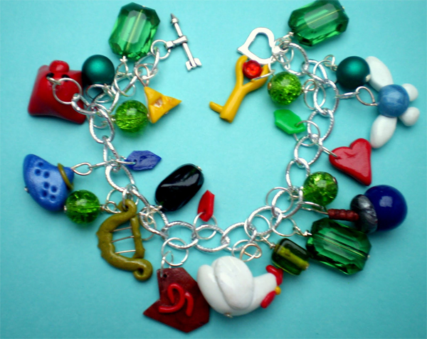
The old Nintendo games tended to be naturally mysterious. There were many reasons for this. One is the graphical limitation of the system. NES games could only display a small number of colors with limited animation. It didn’t have a lot of pixels to work with, either — it was a very low-res system. This made the system’s representations abstracted, and, as such, a little mysterious. Sometimes (often) you literally couldn’t tell what you were looking at. READ MORE >

