STARK WEEK EPISODE #10: “So of course I said yesh of courth” — Sommer Browning on the cover of SELF HELP POEMS
For our last cover artist divulgence of STARK WEEK, here at mighty mighty Episode Ten, we have the top-of-the-mountain comic drawer and comic speaker and deep poet Sommer Browning to share with us her process for the cover of Self Help Poems and her ideas on what exactly will help us all.
 I was honored (drinking) when Sampson asked me to draw the cover for Self Help Poems, so of course I said yesh of courth. After reading the manuscript, I could see why he asked me to draw this particular cover. The poems pull innocence and nostalgia through the streets of pop culture and childhood—and I think I draw like that. He offered me a few wonderful ideas and I pulled together the ones I loved. One of the ideas was the classic self help book cover, so I researched (Googled) what those look like.
I used to work at Waldenbooks (a store that sold textual materials) and the self help section was my favorite (more favorites: Four Loco and images of nuclear reactors). The life-affirming promises on the covers of these books are self-satisfied propaganda at the expense of the self-centered (woman-moms, man-dads, etc.). To me, putting these kinds of promises on the cover of a book of poems was hilarious (Mr. Bean when you are seven years old) and true (Bible)—and I thought it created an interesting juxtaposition (Ice-T & Coco).
Sam also gave me a photograph of himself dressed like Les Nessman in a neck brace waiting for a call from Brian Dennehy. Needless to say, this was pure inspiration. The “Over 7 Sold” sticker was a creative way to conceal a number of things. Pretty much my favorite part of this drawing was Dan Boehl’s suggestion that I add the “*Neck Brace Sold Separately” bit.
I was also in love with spelling the title of the book wrong. So I had a backup cover, a very lo-fi drawing of a fast food type cup with SELP HELF written on it.
Sommer Browning is the author of Either Way I’m Celebrating (Birds, LLC; 2011), a collection of poems and comics, The Presidents (And Other Jokes) (Future Tense Books, 2013), and various chapbooks. With Julia Cohen she runs the Bad Shadow Affair, a reading series in Denver, and with Tony Mancus she founded Flying Guillotine Press, a small poetry chapbook press.
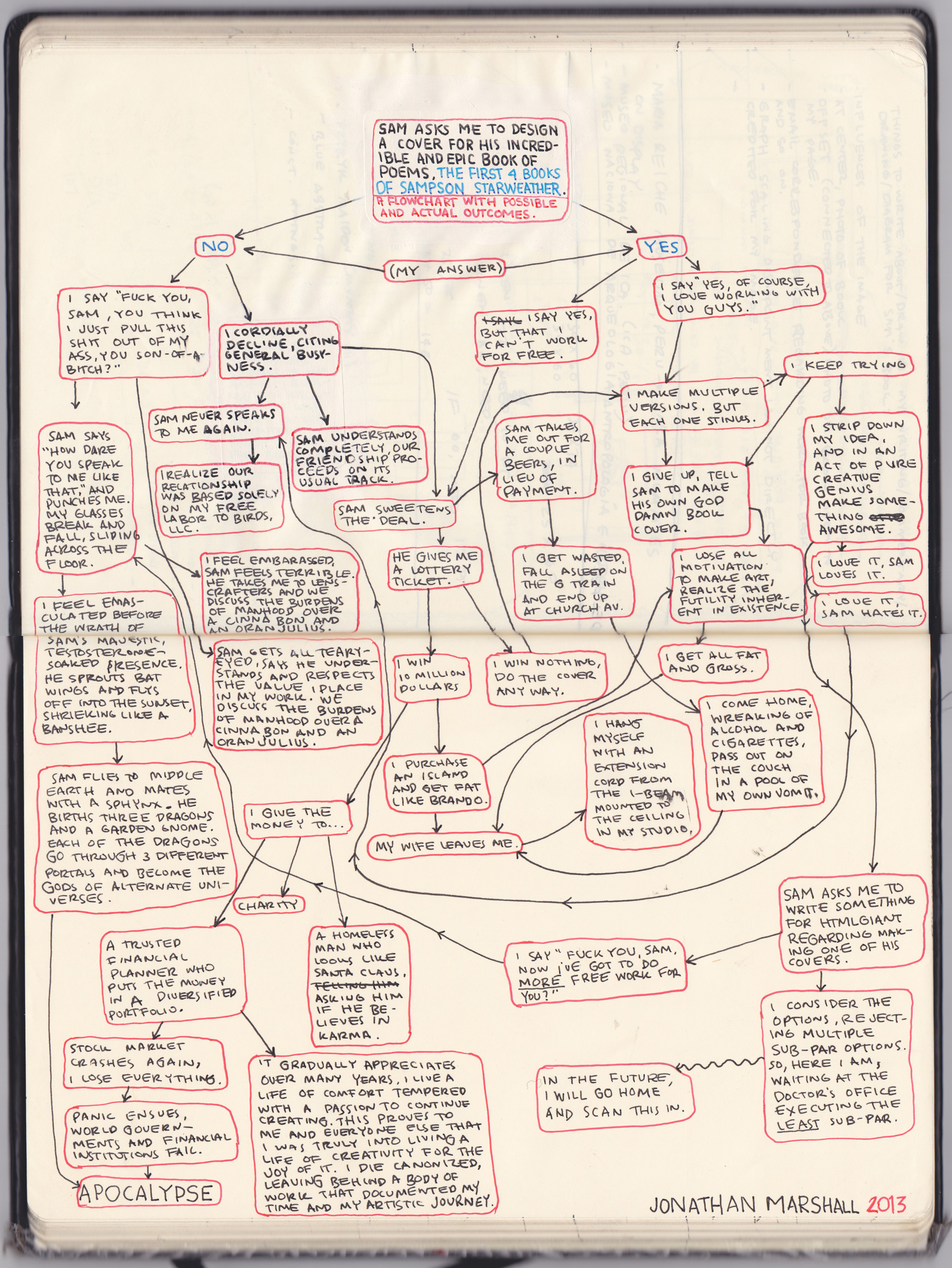
STARK WEEK EPISODE #8: “SAM FLIES TO MIDDLE EARTH AND MATES WITH A SPHNIX” — Jonathan Marshall on the cover of THE WATERS
For Episode Great Eight of STAAAAAAAAAAAAAAAAAAAAAAAHK WEEK, we welcome artist and witty flowchartist extraordinaire Jonathan Marhsall to map the process of developing the cover of The Waters, book 3 of The First Four Books of Sampson Starkweather. More multimedia and interaction coming soon! Including contests to win a copy of this bad boy for yourself!
CLICK THE IMAGE TO SEE IT FULL SIZED

Jonathan Marshall is a visual artist living in New York City, originally from Austin, TX.
He is currently holed up in his studio, preparing for a solo exhibition at Grimm Gallery in Amsterdam, NL, which will open in October of 2013. http://www.jonathanmarshall.
July 19th, 2013 / 12:31 pm
STARK WEEK EPISODE #6: “A few days later Sam called to wake me in the middle of the night to tell me about his Galaga high score at a bar and that the game reminded him of the poems in the book.” — Eric Amling on the cover of LA LA LA

For Episode Six of STARKING IT’S STARKING EVERYBODY SPARKING week, poet and collagist and GQ cucumber Eric Amling answers some questions about working on the LA LA LA cover. Eric Amling is one of our favorite cover artists here at HTMLGIANT (or at least one of Mike’s favorites), so we are very pleased to get a peek into his mustachioed brain!
 1.) What was your experience working on the cover of LA LA LA?
Witnessing a sandwich of friendship and professionalism produce a satiating item.
2.) What was your process (how did you come up with the idea)?
When Sam and I first started talking about the LA LA LA poems we gravitated towards descriptions with a sensation of falling. So I went home and started some different approaches to the cover. A few days later Sam called to wake me in the middle of the night to tell me about his Galaga high score at a bar and that the game reminded him of the poems in the book. I recalled an image I recently cut from the cover of a Limousine and Chauffeur magazine circa early 80s. I thought it brought the digital aspect and feeling of motion with simplicity. Luckily, Sam agreed.
3.) Any stories/anecdotes?
I’m an adult male that occasionally moonlights in the act of collage.
4.) How did your cover relate to your reading the book (or the books content/poetry)?
I approached the LA LA LA book as a separate entity. I imagined finding an original limited edition in an upstate library of a dead city ex-patriot. An old looking book about the future. Assuming I read the book I think this is accurate.
5.) How did your work for this cover relate to your other work as an artist?
As an artist I’d have to say this cover was a departure for me, or rather, an exercise in restraint. I have a tendency to overthink my collages and my cover designs. And I enjoyed using one element of what later became part of a collage as the sole description of the book. I tend to admire most the artist that can show that restraint. To put it another way; it was different because it didn’t have a bunch of colors and asses in it like my other work.
 5.) What is your relationship with Sampson, what was it like to work with him? Tell us one story about him?
Sam and I are friends and neighbors. Our relationship began with our mutual interest in poetry and has been maintained through drinking and sports. His work and email ethics are sound but he can be unreliable with the phone at times.
I may have my time and events wrong but I remember bringing a dear friend of mine to a reading Sam was doing in Brooklyn. Someplace nicer. The Montauk Club, maybe. She is a person who had issues with poetry. Mainly, poets and poetry readings, understandably. I remember Sam particularly nailed it that night. She was moved, entertained and charmed by Sam’s work. I was proud of Sam for that and it shows the reach his poetry can have. His passion for poetry is obvious but it takes more than that to affect people and he accomplishes that.
6.) Do you have any rough drafts, or covers you didn’t use?
I have three, maybe four, other drafts. If any diehard fans are really interested I can send them a file. [Editor’s note: Eric Amling disappeared shortly after this interview was conducted, but we found him later at unrelated blimp party, where he was patiently explaining to the gentleman “piloting” the blimp that the cigar he was smoking was not, in fact, endangering the flight but was rather supplementing its propulsion. We approached him and enthused that STARK WEEK was only, in fact, for diehard fans, and could he please produce those files? Amling, a real matador’s matador, happily obliged. The results are after the jump.]
REDEMPTION FOUR: BETTER THAN EVER OR BETTER OFF DEAD?
In this mini-series the saga of redemption, as frequently manifested in the form of “comebacks,” is investigated. REDEMPTION ONE is here. REDEMPTION TWO is here. REDEMPTION THREE is probably around, too.
This is the last redemption.
II. EMPIRICAL EVIDENCE
c. How it Should Be: Identities Dismantled, Redemption In Transition
The projection of specific moments of the lives of public people following their death results in redemption of a dubious ethical nature. A drastically similar technique, however, can be utilized to facilitate winning the popular support for the redemption-seekers who possess the social acumen to manipulate their experiences. The most insightful public individuals are capable to redeploy the past to “manipulate” the present and pragmatize their intended vision. When predicting how the audience will interpret a series of events, public figures can act accordingly to enter the public consciousness. Once such an immersion becomes possible, the public person can determine how to use it efficiently.
LANCE ARMSTRONG
The most challenging occurrences of public people’s demise appear when their public personas are perceived as an honest extension of his/herself and they act in a way that jeopardizes both their professional and private life. Lance Armstrong’s documented steroid use offers an illustrious example. Armstrong’s professional career lost its significance the moment his distinctions and awards were taken back. Armstrong’s nebulous actions as an athlete led to a discourse on the morality of his philanthropic work and the LIVESTRONG initiative. In such multifaceted cases, the redemption of an individual is most likely to stem from the segmentation of a public person’s identities in the many distinct roles of their private lives and the distinct roles of their public presence. The individual is then responsible to navigate the best means to move towards the optimal level possible, using either sphere to move further ahead as a public person. This process is similar to the crafting of a reputational mosaic that highlights the positive, without hiding the negative.
In what appears to be a part of the distant past, public individuals held the power to control the simulations the media projected. Following events that posed a reputational risk, “damage control” functioned as a means to sugarcoat a harsher reality in the lives of public people.The field of public relations serves an anachronistic idea of how to control a positive public perception, as an endeavor to create a perfect image is no longer the best route to gaining the support of hoi polloi. The most resourceful public image is one that will be largely viewed as authentic.
Naturally, even this “authenticity” may be of a somewhat contrived or smoothly manipulated composition. For instance, the redemptional strength of the Weiner narrative lies upon the way Weiner and Abedin are presenting their private life to the public. The truth is that we–as the audience–do not know what is going on in their private lives, or if they are sharing a bedroom. What if the personal and the public do not align, in Weiner’s reality? He wouldn’t be the first politician to create a bricolage of his private life to ameliorate his public image. READ MORE >
STARK WEEK EPISODE #4: “I saw a small boy on a great precipice” — Bianca Stone on the cover of King of the Forest

For Episode Four of Stark Week, Bianca Stone answers some questions about working with the forest king Sampson Starkweather for the triumphant cover of King of the Forest!
 1) What was your experience working with Sampson?
Joy. It was like working with a doting older brother.
2) What was your process (how did you come up with the idea)?
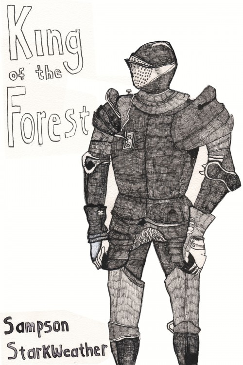
I had just illustrated the Birds LLC book by Ana Bozicevic, Rise in the Fall, and I’d been wrapped up in the idea of the cavalier, the knight. Her book felt like an army charging over a hill. It was always the Joan of Arc figure I pictured with her book. I’d done drawings of knights in armor, looking at a pamphlet my fiancé’s father gave me on armor at the Metropolitan Museum of Art, which has always been one of my favorite things to see there. Obviously they were so insanely masculine. I couldn’t fit many of them into the tone of Ana’s book.
Luckily, I opened Sampson’s book King of the Forest. The knights charged up, offering themselves. But they too seemed too masculine for his book. I say this because the poems had the voice of a young boy, whose vivid imagination was tangible.
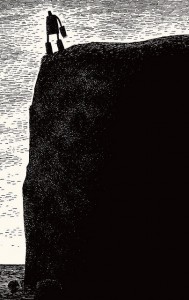
Rather than faceless, colossal suits of armor, I saw a small boy on a great precipice. One whose power was great, but who was afraid and isolated.
The artwork I did for Sampson was inspired by the cover of Ted Hughes’s The Iron Man. Which Sampson really loves. And so do I.

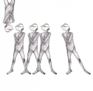
Dark contrasts and cross hatching….I’m already there.
Actually before we were friends we read together, and I remember him telling poop jokes. Or was it a poop poem? He had a chapbook called City of Moths and I bought it! My mom was there and saved the flier with our pics and bios. It’s hanging in the bathroom at her house, and when I was home last time, I noticed him on there! I had never made the connection in my mind.
 Sampson and I are close friends. I love every time I get to collaborate with him because he’s so goddamn energetic. He’s one of the most dedicated, hard working poets I’ve ever met. While it might feel sometimes like your opinion isn’t filtering through his buoyant, manic stream of awesomeness… it is. He listens and takes everything in. He has a very generous heart and he’s a fucking fabulous poet.
Bianca Stone is a poet and visual artist. She is the author of several chapbooks and the poetry-comic I Want To Open The Mouth God Gave You, Beautiful Mutant (Factory Hollow Press), the editor of Monk Books, and a regular contributor for The The Poetry Blog. Her poems have appeared in Best American Poetry 2011, Conduit, Crazyhorse, and Tin House. Stone collaborated with Anne Carson on Antigonick (2012), a new kind of comic book and translation. She lives in Brooklyn with her boyfriend, poet Ben Pease, and their cat. For more information, check out her page at the Poetry Foundation.
STARK WEEK EPISODE #2: “Off the Top Rope” — Matt Bollinger on collaboration with Sampson Starkweather

For Episode Two of STARK WEEK, we hear from Matt Bollinger, who designed and drew the front and back covers of The First Four Books of Sampson Starkweather.


 Sampson wrote to me early last December to ask if I would make a cover for his book. “I’m very busy,” I summarily replied but in less summary and more polite terms. Because of a new full-time teaching job and an impending solo exhibition, I felt there was no way I would possibly have the time to make a cover. The next email I received from him came like a sudden summer storm (particularly strange in the final week of a wintering semester) complete with simultaneous heavy raindrops and sunshine. He supplied approximately 43 ideas for the cover, including examples from the history of fantastic poetry covers. Here’s an example:
“A note about Andre the Giant off the top rope: this is actually an image that doesn’t exist, which is why it’s appealing to me, the unknown, what only lives in the imagination…so to my knowledge, Andre the Giant has never jumped from the top rope, but god, how i longed to see that; (i’ll send you the poem about it), but in my imagination, i love the image of the 7’5 almost 600 pound flying through the air Jimmy-Supafly-Snuka-style, althought i’m thinking the image would only be part of him or his silhouette, or partly his enormous shadow….”
 A few days after the semester ended when I was in rural Illinois staying in the log cabin where my fiancé grew up, I found myself making numerous studies for the cover. It seemed that I was going to design the thing after all. Sampson, like his neck-brace wearing alter ego from the sectional cover of Self Help Poems, is impossible to say “no” to. Of course, I realized that I couldn’t possibly have let this chance go by. I felt too much of a kinship with his poetry. In my painting-collages, I grapple with a similar intersection between memories (possibly misremembered) and the present moment; between romantic hopefulness and a self-conscious criticality that withers nostalgia. Sampson puts it well in Self Help Poems:
Nintendo always felt more real than life. Simple yet somehow beautiful worlds, constantly breaking down, designed, whether intended or not, as pixilated avatars of hope. Old school video games are perfect precisely because of how unreal they are. They don’t try to teach you anything, except if you see a hammer, you better grab it.
The process of designing the cover was definitely collaborative. In my recent exhibition at Zürcher Studio in New York, I collaborated with a number of poets, Farrah Field, Alina Gregorian, Steven Karl, and Paige Taggart, who supplied texts for collages I made that depicted notebooks (Dan Magers handled the editing process). This project readied me for the onslaught of fantastic ideas that Sampson and I power-spiked back and forth (not unlike a twisted game of dodge ball where the only defense against the red rubber ball hurtling at face-bash speed is to slam it with your best haymaker).
When developing the images for the front and back covers, Sampson and I discussed Andre the Giant, Louis Zukofsky, “guerrilla underground hand-drawn poetry press style”, LARPing, Nintendo and Mickey Rourke among other things. Sampson had become obsessed with both the coat of arms and a large number 4 modeled after the “A” on Zukofsky’s famous cover. While we tried out a number of variations (see below), we went with the big 4 on the front and the coat of arms on the back.
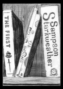


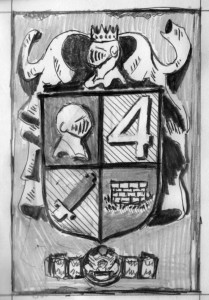
 I had the idea that the coat of arms should spawn from the inner selves of the various personas in his books and arrived at the hobo-TV-fire, the well (Sampson’s idea), the butterfly, and the grabbable hammer mentioned above. We hoped that his cover would resemble an older generation of much coveted books, the sort grabbed hungrily and pressed to the chest in basement bookstores or, more likely, found wrapped in a banana leaf on the shore of a distant island, the same far-away shore where you might find yourself 300 years in the future founding a religion who worships that sacred number: 4.
Matt Bollinger is an artist who lives in Peekskill, NY. He has exhibited extensively in the U.S. and France. In March 2013, he had his most recent solo show, Bed on the Floor, at Zürcher Studio in NYC. His work has appeared in the New Yorker and has been written about in Le Monde, Elephant Magazine, Anthem Magazine, and elsewhere. He is represented by Zürcher Studio, New York, NY. www.mattbollinger.com
Dear Rauan,…(3)
*****
[ note: I’ve never been happier, never felt more fulfilled, because I know that I am helping people — and thanks again to Kim Gek Lin for turning me on to this xoxox ]
*****
and this time we have a desperate cry for help from Paul in Massachusetts:
dear rauan
my wife won’t fuck me because I’m not “alt lit” enough and when we do get hot and heavy she demands we role play tao lin and marie calloway doing 69 while we’re tripping on shrooms. And I just can’t do it, rauan, even though it does sound very erotic. One time, also, a whale stuck its head out of my wife’s Mumu (yes, this is what she makes me call it) and started licking my balls
and i was just freaked out
and i was just freaked out
and i was just freaked out
and i was just freaked out
…
…
is there something wrong with me, rauan?
thank you in advance,
Paul “boost” Refrere
*****
*****
And, so–
Rauan Responds:
*****
Dear Paul,
1) first of all, “tao lin” READ MORE >
REDEMPTION THREE: BETTER THAN EVER OR BETTER OFF DEAD?
In this mini-series the saga of redemption, as frequently manifested in the form of “comebacks,” is investigated. REDEMPTION ONE is here. and REDEMPTION TWO is here. Read REDEMPTION ONE before REDEMPTION THREE, inserting REDEMPTION TWO between them.
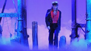
John Galliano, redeemable or not, is alive.
II. EMPIRICAL EVIDENCE
b. Better Off Dead? Two cases of Dubious Post-Mortem Redemption
As the example of time illustrates in the case of Adler, exogenous elements factor in whilst public figures are on a path towards redemption. Interestingly, the most practical way to pursue redemption might be dying. The death of a public person continues–to this day of non-secular dimensions–to make the majority of media consumers feel a predominant desire to respect their deceased status. This theory effectively extends to the redemption of some of the most controversial individuals.
MARGARET THATCHER
Margaret Thatcher’s death sparked a discourse on the very topic of the appropriateness of global media industries using unnecessary euphemisms following the passing of public figures. The mentality of “one must not speak ill of the dead” looms as a dangerous approach when it pertains to political leaders. By picking and choosing the legacy of politically-engaged people, those who pick and choose create a false record of the events that carved the lives of others.
Thatcher’s individual saga as a leadership paradigm certainly includes grand successes. She was elected thrice as the Prime Minister of the UK and was both the first female PM of the UK and first female leader of a Western country in recent history. Additionally, she actively introduced her set of conservative, nationalist political beliefs, widely known as Thatcherism.
Heated debate surrounded Thatcherism, as well as Thatcher herself. For media outlets to neglect the heavy criticism she received–and often persuasively argued against–because of her death appears callous, but also oxymoronic at its core subject, because it contradicts the nature of the person Thatcher was: a self-proclaimed “conviction politician.” Her priority was staying true to her values, despite the anticipated reaction her values would yield. It seems highly unlikely Thatcher herself would hesitate to speak ill of the dead. READ MORE >
Dear Rauan,… (2)
*****
[ this is the 2nd installment of my “Dear Rauan” advice column. special thanks, again, to Kim Gek Lin Short for reminding me that I can and should “help people” ]
*****
and, anyways, this time we have Marc from California
dear rauan,
i’m up for tenure–this is not the route I thought my life would take, and in the meantime every where I turn I hear a snide bro poet remark about lower than prestigious writing school teachers with shit for names and shit for publications. hmmm maybe I could give my shit name-brain to htmlgiant and mar their tar-stained code of duress. but I’m motivated to pursue higher than dick personality types READ MORE >


